A Home for Converse
Converse needed to grow beyond the confines of Nike.com. We wanted to create a brand new experience that went from a traditional e-commerce site to a platform for discovery, easy shopping, and cultivating relationships.
Role and Responsibilities
As creative director of UX, I was responsible for overseeing a team of UX designers. I worked alongside a visual CD with an ECD as oversight.
My day-to-day included:
Ensuring that the project aligned with client needs and requests and that milestones were being met per sprint
Collaborating with UX designers to address any design issues that came up
Presenting completed work for each sprint alongside designers
Delivering the project in a way that educated and excited both Converse employees and R/GA internally
Impact
As of 2024, the redesign completed in 2018 is still in use. This longevity is a testament to the excellent collaboration between R/GA and Converse. Most importantly, it highlights the design thinking and effort that went into ensuring the CMS was built to adapt to the client's evolving needs over time.
Approach
Based on the strategy work that was done internally on R/GA’s side, the redesign focused on these 3 themes.
Discovery
Relationships
Effortless shopping
The following sections dive deeper into what each of those themes mean and how we translated them into a site experience.
Discovery
Discovery happens when a homepage doesn’t feel like a homepage.
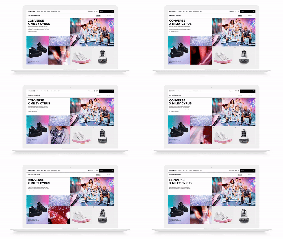
The homepage was designed with modularity in mind. It empowered Converse to feature high heat products while also providing space for classics.
Modular homepage design
We also presented various ways of how content could be presented. This demonstrated to clients that the design system could accommodate the various needs that may come up across various teams within the organization.
Discovery happens when search feels more social.
Search was designed in a way where it felt more integrated with the site and the Converse community. While pulling in results and top suggestions based on what a customer was looking for, we surfaced up popular searches that may be of interest. We also doubled down on continuing the editorial grid within the search feature itself.
Social search
Discovery happens when an experience is as special as the product itself.
Each collection/collaboration with Converse is unique and and exciting as the next. For these exclusive drops, not only did we want to sell products that were currently available, we also wanted to drive excitement by featuring upcoming and past collections, which would drive customers to create calendar reminders and signing up for drop notifications.
Exclusive drops
Relationships
Relationships get stronger when consumers can share with one another.
Remember, this was 2018 and serving up notifications to review a product that you just purchased was still considered cutting edge.
For product reviews, we wanted to create an experience that was brief and to the point while allowing for personalization whether it was through the photo/video that you snapped or your unique signature that would serve as a watermark to your review.
Leaving a product review
Relationships get stronger when their more relevant.
To better serve relevant content to customers, we implemented a familiar liking system. We enhanced it with the "LOVE IT LOVE IT LOVE IT" feature, which achieved two key objectives:
It branded the liking mechanism specifically for Converse
It made it easy for the team to localize the feature into other languages
LOVE IT LOVE IT LOVE IT
Relationships get stronger when consumers can take part in the story.
To create a more humanized shopping experience, we aggregated customer reviews (mentioned above) into a Converse Community section. The community page served as a central hub to discover how others are rocking their Converses. Community content can also be found on relevant individual product detail pages.
Converse Community
Effortless shopping
Effortless means giving consumers shortcuts.
Switching between browsing and the shopping cart can be disorienting. To create an effortless shopping experience, we focused on providing customers with quick and easy ways to add products to their cart without losing their place.
Effortless shopping
Effortless means doing the heavy lifting for the customers.
Again, this was 2018.
Apple Pay was just announced and we needed to integrate it into the site experience. This was by far one of the most popular features that came out of the redesign, standing ovation and all at the town hall. 😂
Yep, it's Apple Pay
♨️ ♨️♨️📼 ♨️♨️♨️
The Dream Team
ECD: Una Walsh CDs: Gabriel Cheung, Karen Bonna Rainert, and Gene Lu. Visual: Jean-Lou Renoux, Chiayu Chang, Han Song, Woohyun Lim, and Kevin Lai. XD: Mikaila Weaver, Terrence Ma, Catherine Rosenwald, and Natasha Sligh. Copy: Kendra Jones and Leah Alfonso.


