Rungry App
“Hey, want to go run a 5K? Oh wait, how about a 10K?”… Huh?
The problem
Running is hard and one of the reasons why is because of the goals we’re “supposed” to set. A 5K, 10K, half marathon, marathon, etc., they’re all arbitrary goals/distances. Did you know that the marathon was based off of an Athenian messenger who ran 26 miles from the coastal plains of Marathon to Athens to deliver the message that the Greeks had successfully pushed back the Persians? And guess what, he died at the end of that run. Not cool. ☠️
What if we gave runners a real, tangible reason to run? Imagine running not just for fitness, but for the sheer joy of earning a delicious burger, a decadent donut, or an ice-cold beer. Let’s face it, who wouldn’t be motivated to run for tasty rewards they can enjoy right away?
What is it
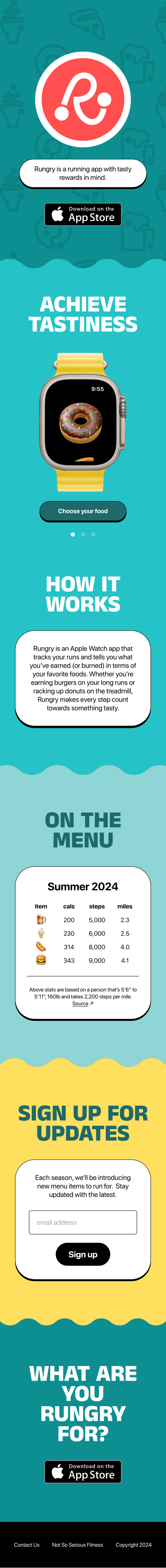
Rungry is an Apple Watch app that tracks your runs and tells you what you’ve earned (or burned) in terms of your favorite foods. Whether you're earning burgers on your long runs or racking up donuts on the treadmill, Rungry makes every step count towards something tasty.
Role and responsibilities
I partnered up wtih Kevin Bastien to develop this app. Kevin is responsible for all things tech-related whereas I’m on the design side of things. Specifically, I am responsible for:
App design
Selecting your goal
After starting up the app, runners pick from a list of edible goals that they can run for. At the start of each season, we refresh the menu of food items. For example, during the summer season, runners can run for beer, hot dog, burger or ice cream. This keeps the goals timely and relevant, making the experience more engaging and motivating.


What are you Rungry for?
Going for a run
During the run, the app focuses on progress towards a runner’s goal, i.e. food. Runners can also swipe to view additional details such as distance, calories and number of steps taken. Unlike most running apps, pace doesn’t make an appearance in the app since it doesn’t correlate with earning a tasty achievement. For example, “I earned 2 donuts by running a 6’20”/mi pace” doesn’t make sense whereas there’s a clearer connection when someone says “I earned 2 donuts by running 5.2mi” or “I’ve taken 9,312 steps for those 2 donuts I just ate!” Runners can also swipe in the opposite direction to end the run.


In-run feedback
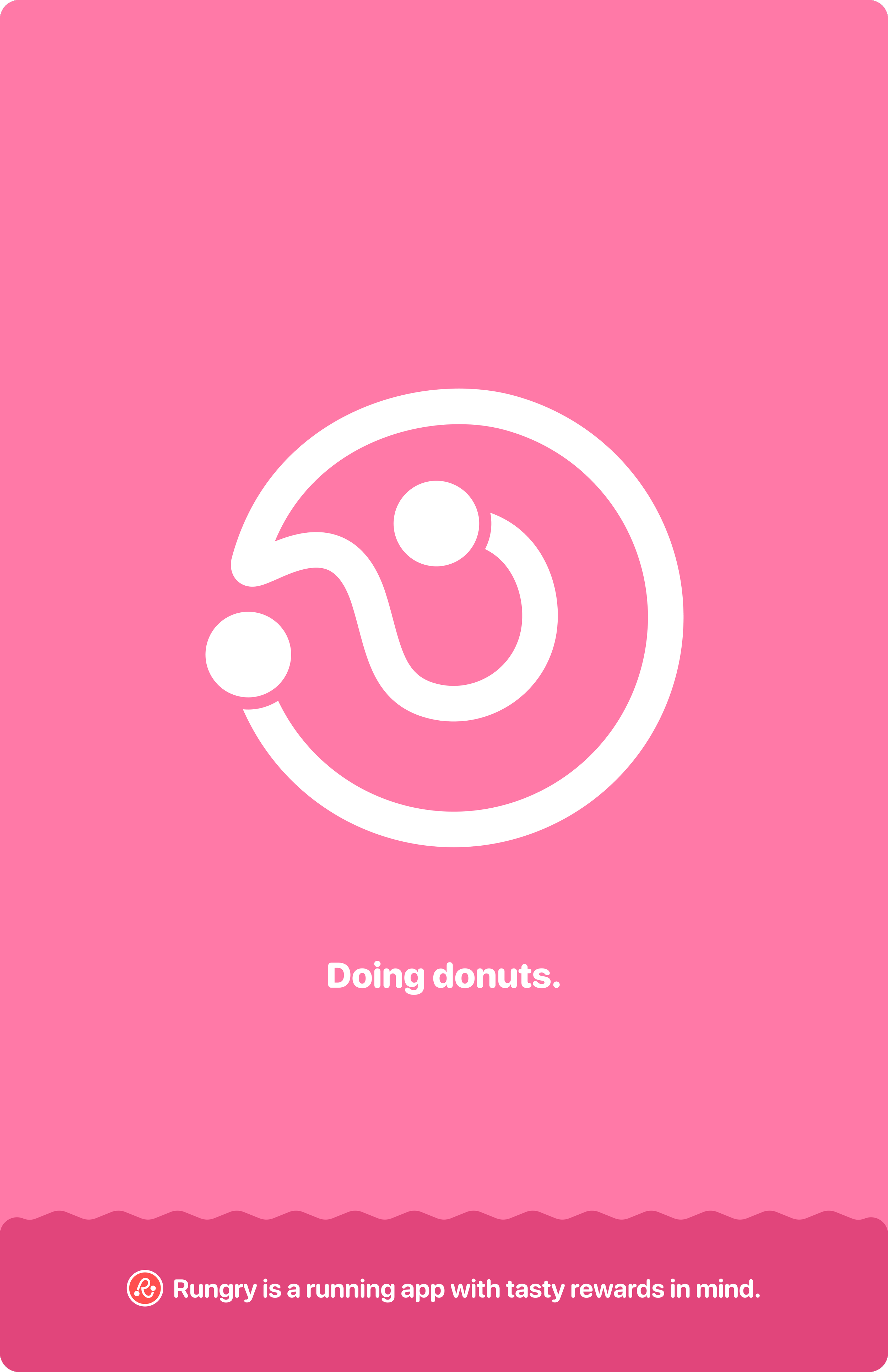
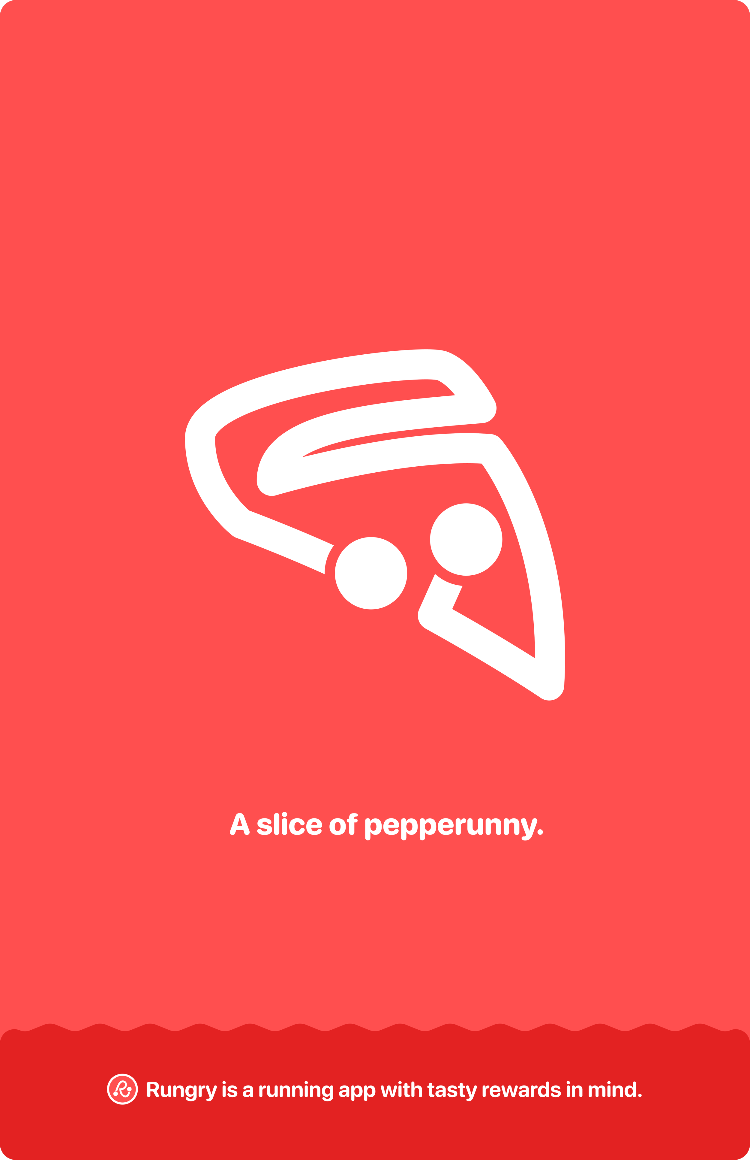
During a run, the app displays a runner’s progress towards their selected goal using a flashing animation. The flashing animation eventually fills up as the runner works toward their goal. When the runner completes an item, they’re notified with an audio/haptic feedback and continue onto the next one.
The rundown
After completing the run, the summary screen displays the total number of items earned with additional information below. The following shows how the summary screen scales based on the number of items earned.


Brand design
Disclaimer: I normally don’t take it upon myself to do logo/brand design, but when it’s a team of two, you make do
Logo and style
The logo design process is always messy and as you may already know, designing a logo/brand for something super close to you is even messier. Below are some explorations through the messiness before landing on a final design.
Being Rungry turns us into monsters. This concept explores the various monsters we become.
What if Rungry can take shape in various forms of food? We initially liked this direction as it allowed the logo to scale, but it started to feel like…

Burger King?

What if Rungry made running a piece of cake?

What if the Rungry workmark was reminiscent of store signage? For this to scale, the “Gry” would swap out with the things that runner would run for.

The letter “R” started to look more like a runner… with feet. Oh no.

What if the run itself represented the thing that you’re running for?

Every run has a starting point and a finish.
Before doubling down on the logo, I explored how we could potentially scale the visual language across various types of food with some simple messaging.


Fonts and colors
And the landing
To introduce Rungry to the world, we created a landing page (tada!). We briefly explain what the app does, lightly demonstrate it and give people the heads up that there’s a changing menu with every season. Visitors can also sign up for a newsletter where they’ll get information on the latest items they can run for and editorial focusing on local spots from around the country where the Rungry community is satisfying their runger needs post-run.