OMORPHO App
OMORPHO Gravity Sportswear is training gear that distributes small amounts of weight naturally across your body, so you get fitter by just changing what you wear. With the OMORPHO G-Vest+ (an NFC tag enabled vest), comes a digital experience that offers users fun, fast and effective workouts designed specifically to get the most out of their gear. These sessions are known as Gravity Sessions.
Approach
Based on our stakeholder interviews and knowledge from similar past projects, we established a set of experience principles that would help guide this project.
Simple
Form a healthy habit through simple actions that don’t get in the way of life.
Relevant
Recommend activities based on what has been done.
Engaging
Make small wins possible leading to an appetite for bigger achievements.
For the MVP product, we focused on the following core moments.
Getting started
Starting a workout
Doing the workout
Celebrating the workout
Viewing your progress
Purchasing product
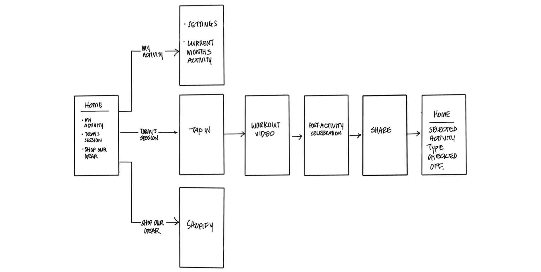
Prior to briefing the visual design team, I led the XD team in mapping out the app and the core flows (above). We worked with the development team to ensure that what we were proposing was all doable.
Tap on the vest / Do the workout / Celebrate
App sitemap overview summarizing the key moments within the OMORPHO app experience
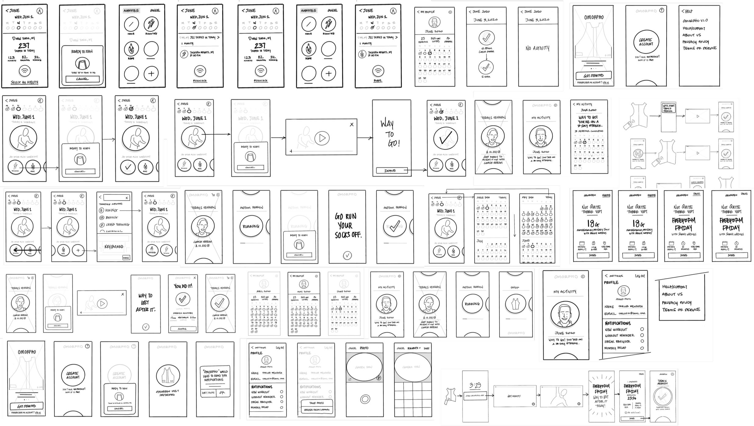
Quickly iterating through core screens with the XD and development teams
Getting Started
In addition to entering standard profile information, we wanted to make the onboarding process visually engaging while also providing users with a preview on how to start a workout using the tap behavior. In this flow, we ask users to add their product by bringing their phone near the NFC tag embedded into their vest.
Starting a Workout
Users can start a workout by starting directly from the app itself or tapping their phone onto the NFC tag embedded in their vest.
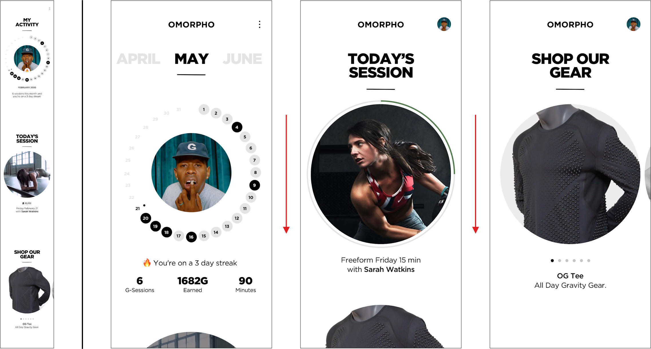
When starting from the app, the home screen defaults to Today’s Session, which includes instructor name and high level details about the workout. Users can also swipe up/down to access various parts of the app, i.e. Activity screen, Shop Our Gear. Tapping on Today’s Session starts the workout.
OMORPHO Home Screen
Starting a workout from the app itself
Starting a workout from tapping phone to NFC tag
Completing a Workout
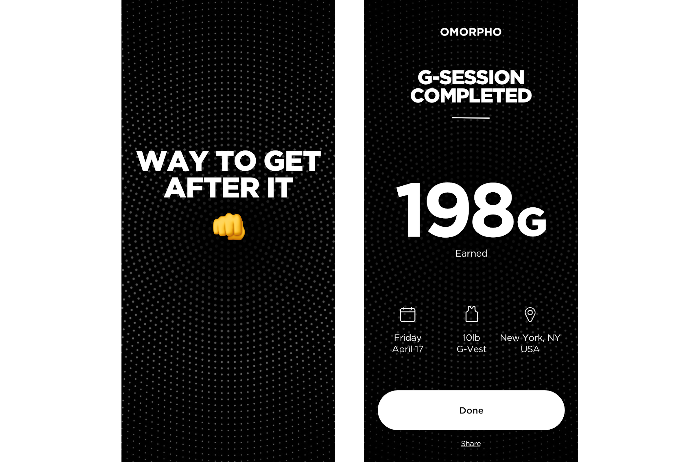
After completing a workout, users are presented with various congratulatory messages that are based on various factors (time of day, frequency of workout, effort exerted, etc.). By keeping this celebratory moment simple and text-based, we can hone in on relevancy through messaging.
Celebration screen appears after completing workout
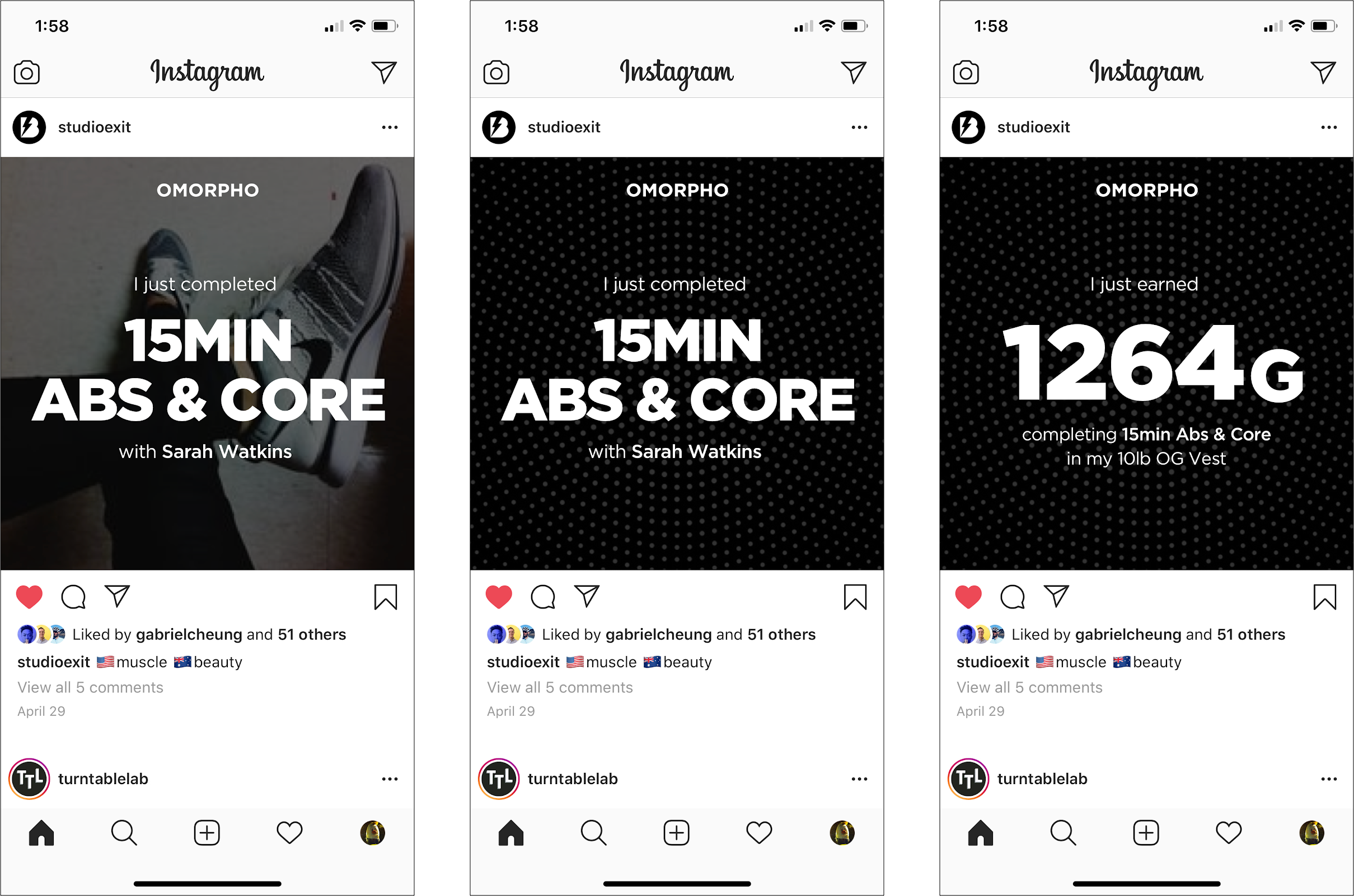
Users can share various data points and customize the visual background of their social shares
Viewing Activity
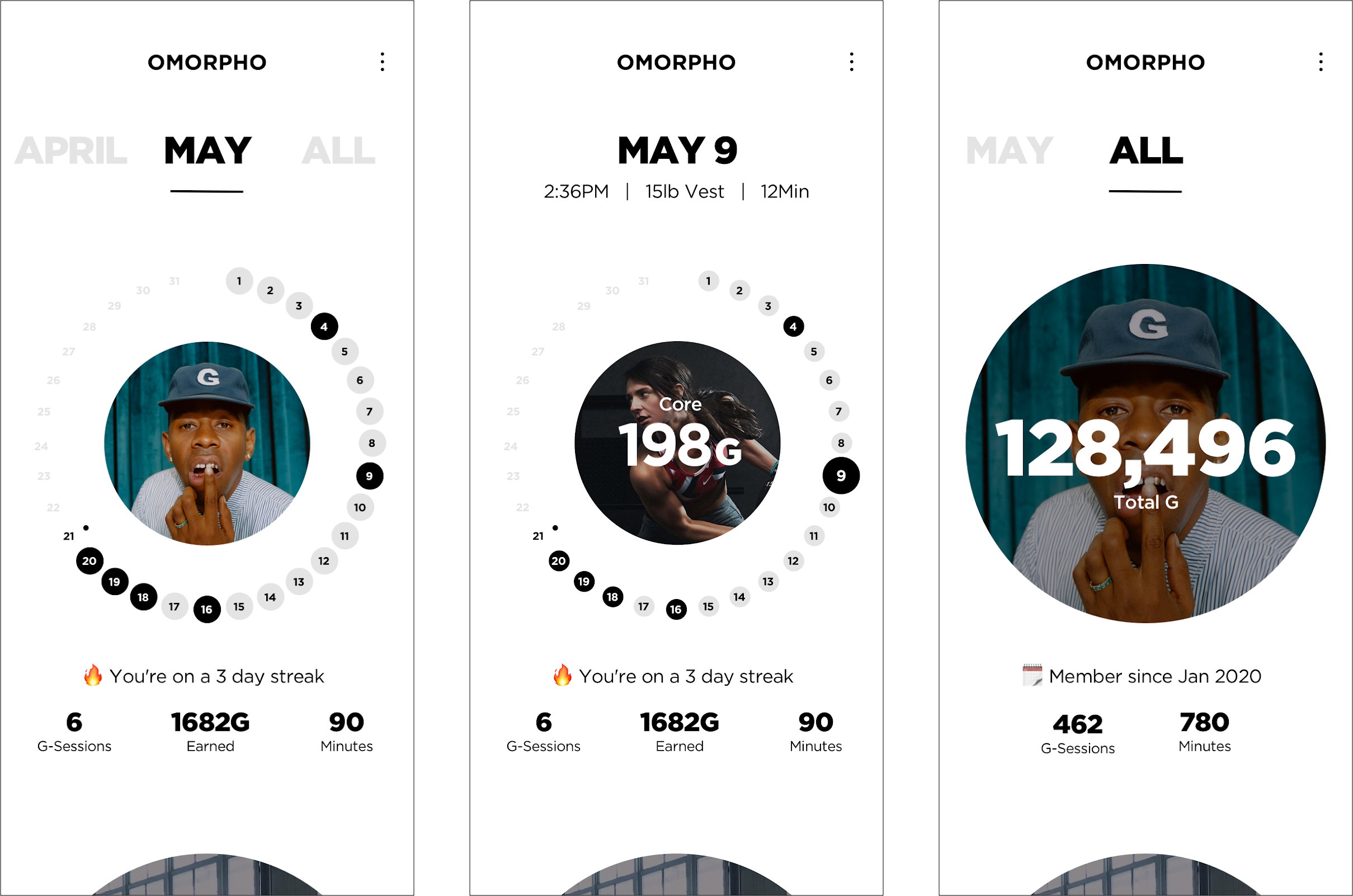
The activity view displays 3 different levels of information while also utilizing game mechanics to incentivize the completion of all activities for the current month. For example, on days where an activity has been completed, it is filled in with a black circle.
Swiping left/right switches between months while tapping on a specific day displays activity data for that day.

