DuPont’s Invent a Better N:OW
DuPont had split from Dow Chemical and its agricultural unit, Corteva Agriscience, which were both plagued by controversies of animal testing and other environmental lawsuits. DuPont needed to rebrand itself as an innovation company focused on making the world a better place.
Approach
Unlike most innovation companies, DuPont is innovating and creating products and solutions that are essential to today’s problems, now. To showcase just how “now” we mean, the campaign team partnered with Imposium (a part of R/GA’s incubator program) to create the “most now-est” video. Using overlay technology, Imposium and R/GA created dynamic videos that reflected what DuPont was creating at that moment in time when viewing the video. Hundreds of personalized videos were dynamically generated based on time of day, day of week, and even the device that you were viewing the video on to create a sense of now-ness.
My role involved leading a team of UX designers to redesign the overall site and to thread the concept of now-ness through DuPont’s N:OW landing page experience and even into a 10x10 physical dome at a TED Talk where DuPont speakers were kicking off the new innovation group. This post will be focusing on the latter, i.e. landing page and the 10x10 dome experience aka the N:OW Machine.
Concept
N:OW Landing Page
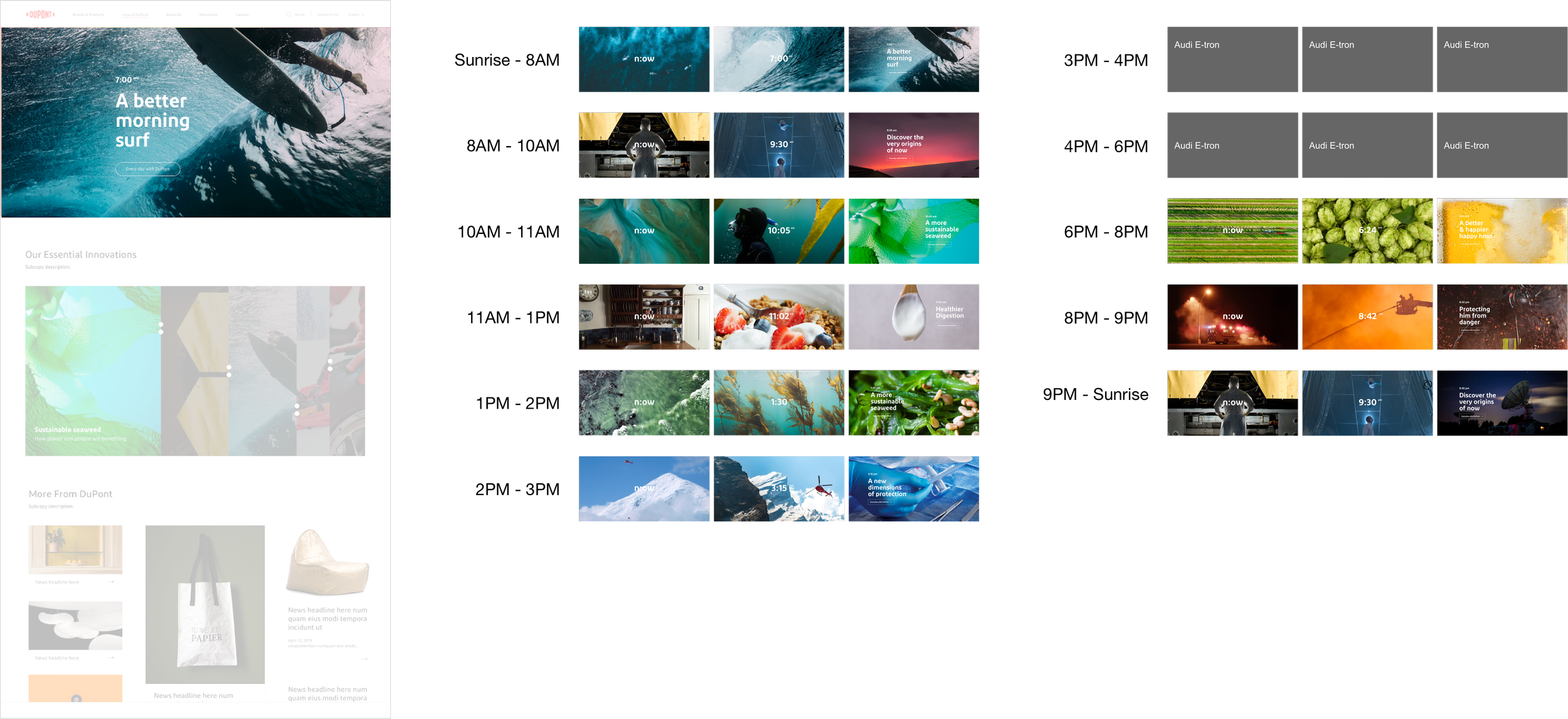
The N:OW landing page took inspiration from the dynamism of the campaign video. When visitors came to the site, they saw innovations from DuPont relevant to the time of day of their visit. For example, if you visited the site in the morning, you’d witness surfers getting their morning session in on surfboards made with DuPont’s latest Kevlar technology.
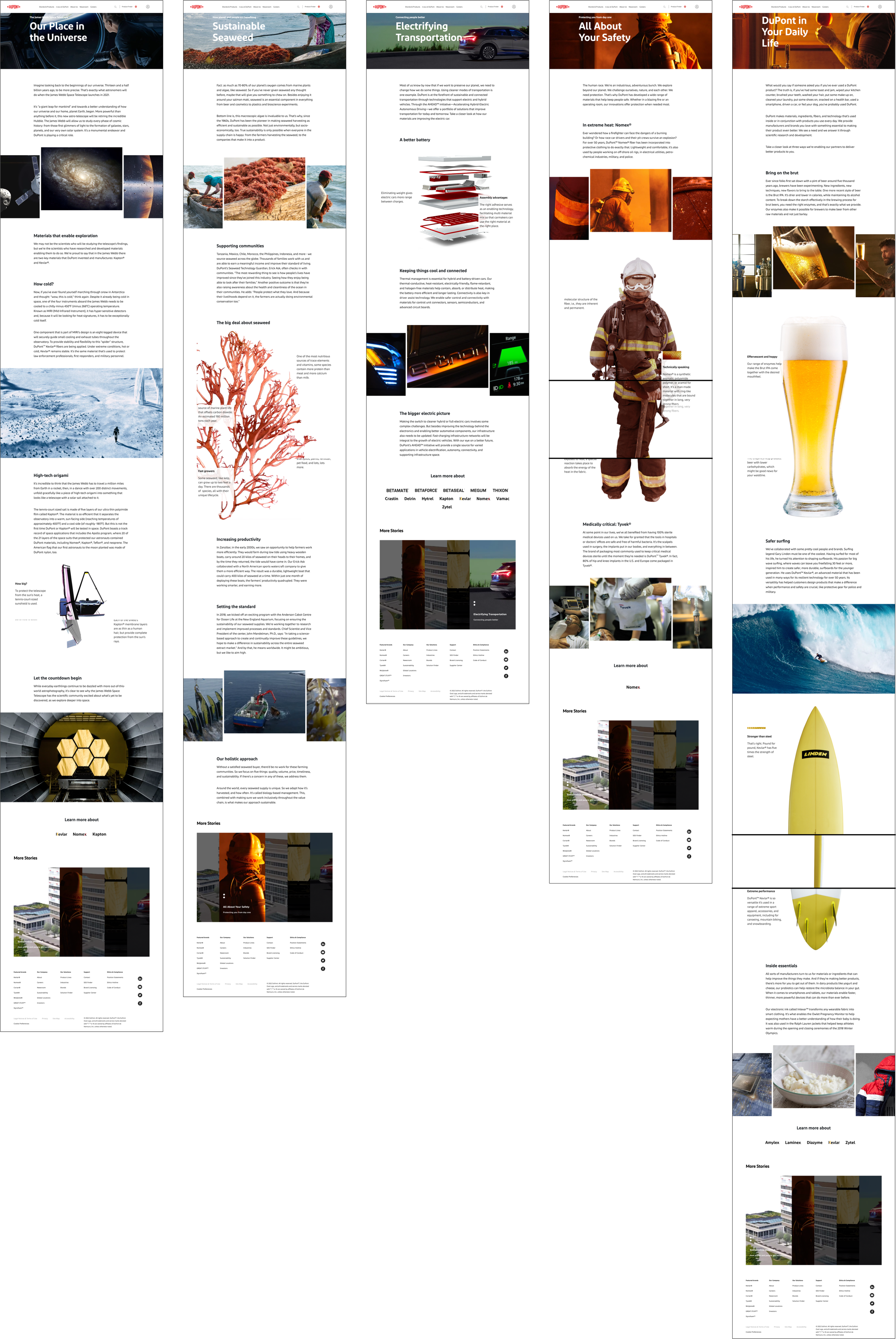
We also provided the audience with a more immersive environment if they were to click deeper into the content. We did this by creating bespoke web components that provided a variety of product views and information as the user went through the site.
Initial sketches showing the landing page as a “live” dashboard showing DuPont’s impact around the world
Schedule that mapped out the content displayed on the landing page throughout the day
DuPont is known for being an ingredient to a product and not necessarily as a final product itself. To reinforce their role in everyday products, each featured story at the top of the landing page focuses on what DuPont makes possible, e.g. surfing, firefighting, space exploration. Inspired by Powers of Ten (1977), we started with a high level/overview shot and then transitioned into the details.
Imagery animates and transitions from high level and into the details
The featured content at the top of the landing page changes based on the time of day
Using existing templates from the overall redesign, we created new bespoke web components to present a more immersive environment within the article pages.
The N:OW Machine
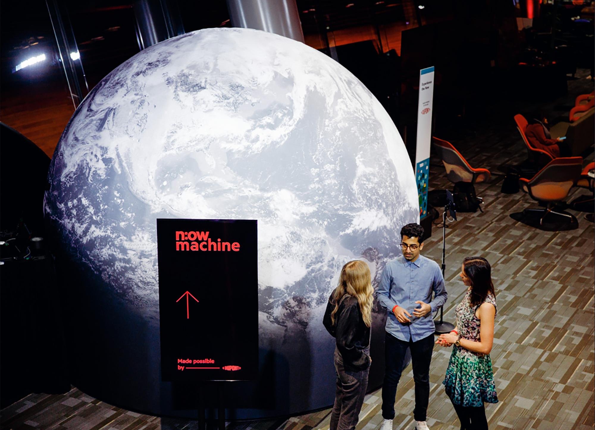
After launching the redesigned site, DuPont partnered with TED for a series of talks and wanted to create a physical installation at the conference. The brief was to design and build an immersive experience to showcase DuPont’s latest innovations. We partnered with Thinkingbox to create a 10x10 immersive dome experience that brought to life the innovations of DuPont from: Earth to space, cellular to all of humankind.
Continuing with the Power of Tens inspiration, I had mapped out a rough framework for the N:OW Machine experience. Initial ideas included starting the projection on the viewer to show what was happening at a cellular level and then expanding to the dome itself as the viewer traveled into space.
We also considered the experience for people waiting in line for the N:OW Machine. This included digital displays that visually represented where a group was within their N:OW journey. Specifically, visual tactics such as scale were used to represent the progress from cellular to humankind / Earth to space.
After the N:OW Machine experience, we recommended that visitors received a video highlighting their journey from the depths of the ocean and into space. However, due to budget and other restrictions, this was never executed.
An email sent out after the experience with a video summary showing your journey (video projected onto body with narrative overlay)


