Vibe coding Rungry
After years of keeping Rungry on the back burner, I finally started building it in Xcode with the help of Claude Code. In just a few days, I had a working app ready for App Store distribution. This post documents that journey and beyond. 🍿
3rd release
03/10/2026
Finally had some time to play with the app and made some major updates.
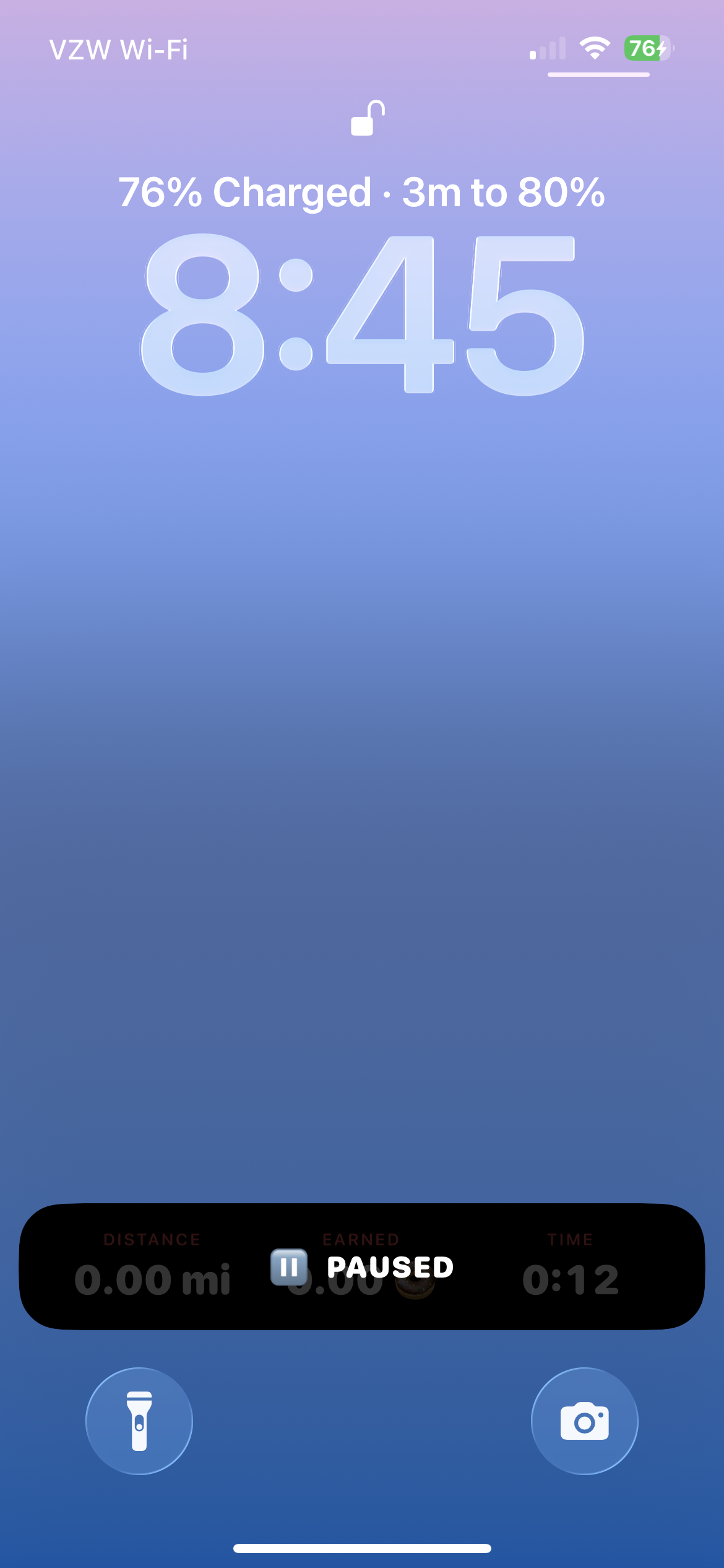
Haptic on pause reinforces the idea of pausing a run
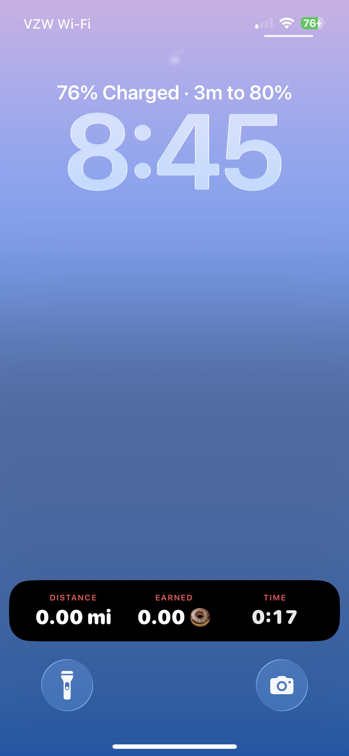
Live activity widget so that you don’t have to open your phone to see how many consumables you’ve earned
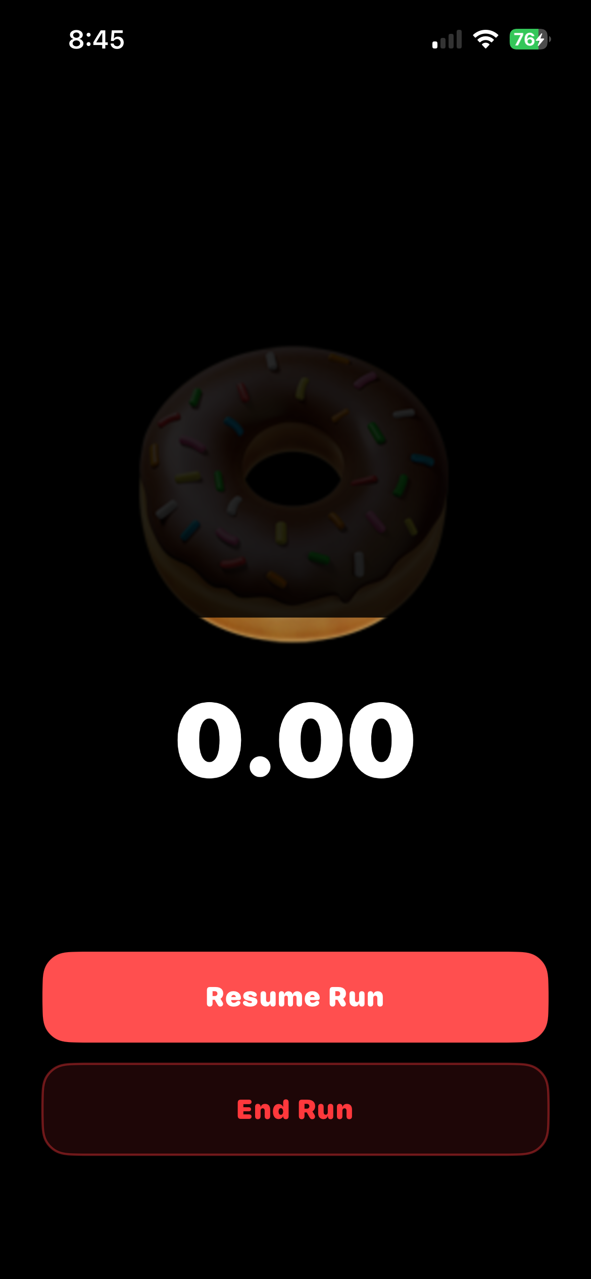
Pause state for live activity view in case you didn’t realize your run was paused
App now supports background mode so that the app doesn’t close mid-run (the worst)
And don’t forget to leave a review for the app, which appears after you earned some delicious snacks during your run
Approved.
03/04/2026
Huzzah, app has been approved and it’s now in the App Store! Make sure to check it out and HMU w/ feedback. Download Rungry on the App Store.
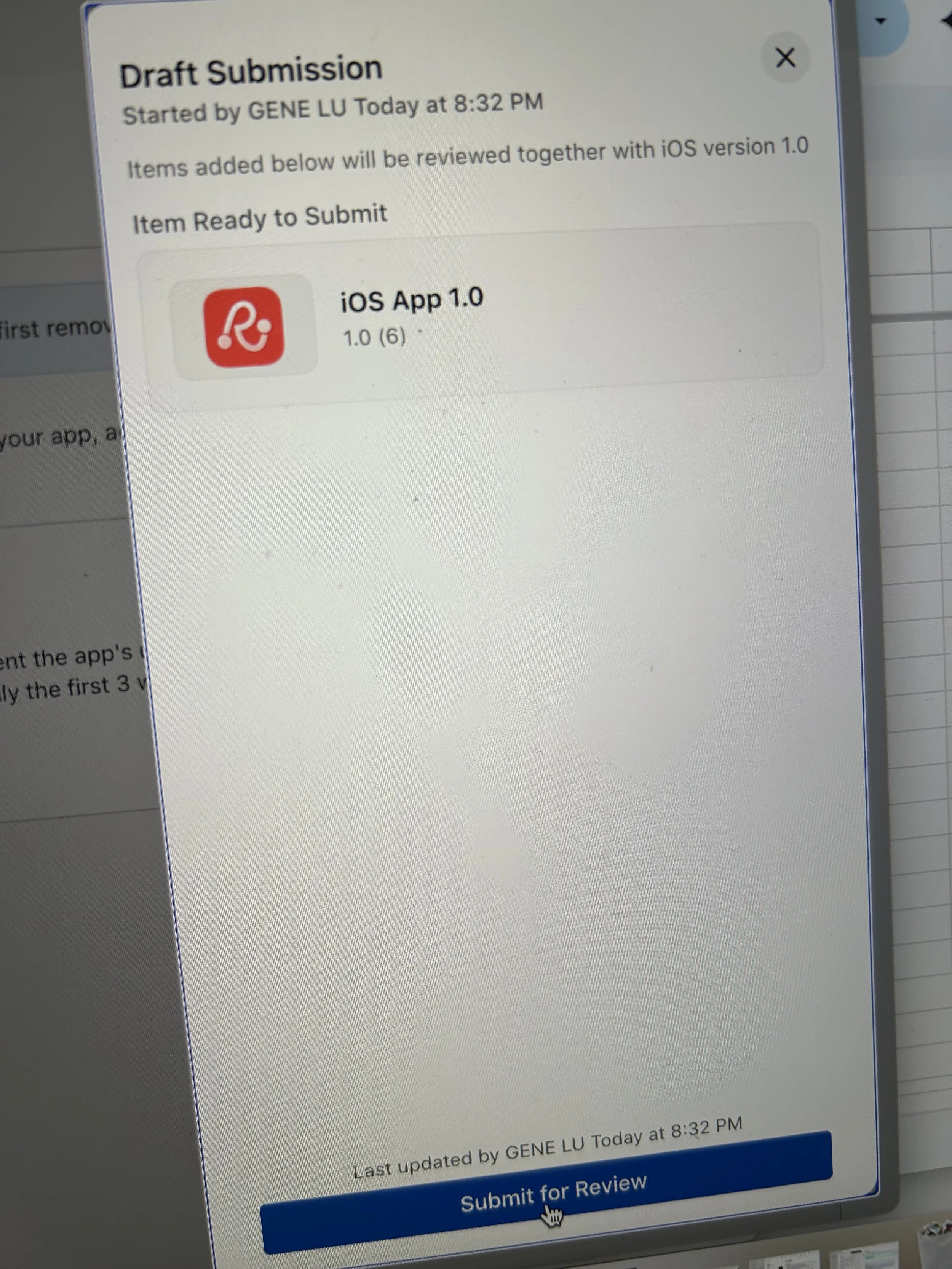
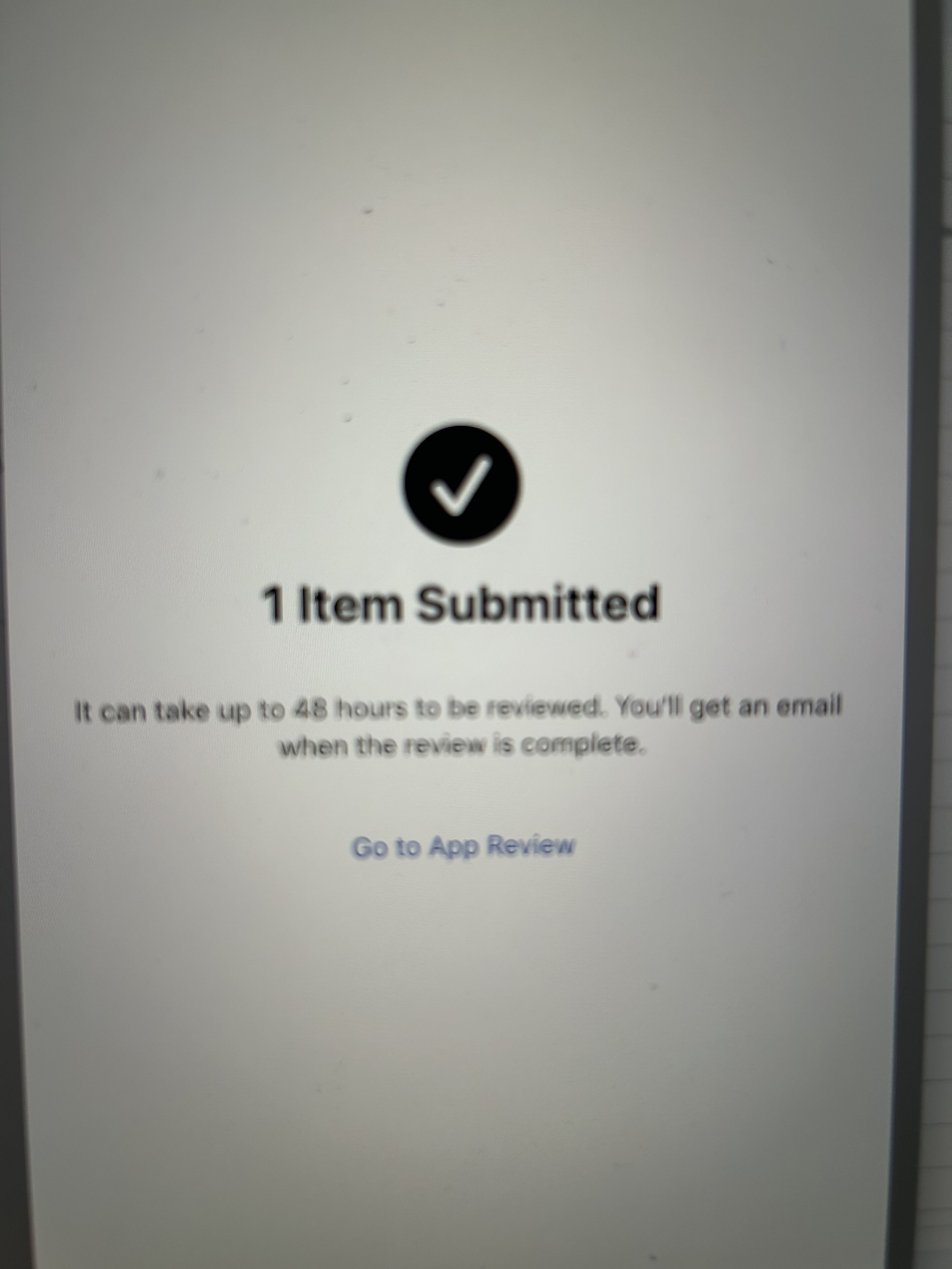
Submission
03/02/2026
I feel like I’m back in 2011 where I was hacking together tappable prototypes on mobiles devices using Adobe Fireworks and a javascript library that was put together by some kind folks out in Norway. Claude Code has really made the impossible feel possible and I’m 3ish days in and submitting my first iOS app into the App Store. Never thought I’d be able to do this on my own (obviously still pending app approval). 48 hours for approval. 🤞
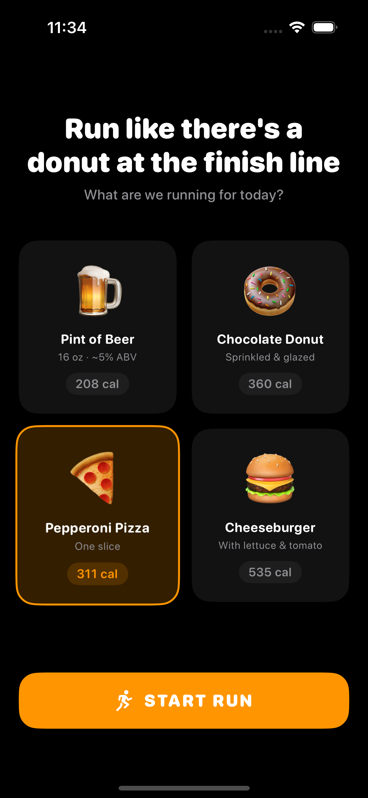
Build 3 | Home screen
03/01/2026
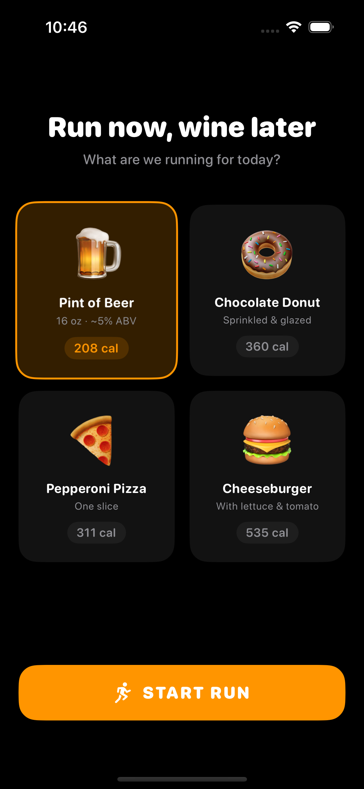
I originally liked how the item selection screen displayed additional metadata per item, e.g. Item name, number of calories, and a little bit of additional info. However, it felt intimidating to see all that information up front. From my past experience designing running apps, the more data shown, the quicker the experience skews towards non-casual runners, and that’s not what Rungry is about. I would rather have people debating the number of beers they earned on their run vs. calories burned.
Instead of showing the metadata off the bat, I hid it behind each card. With a swipe, users can quickly access calories and some other info to get a better idea as to what they’re about to run for.
Before
After
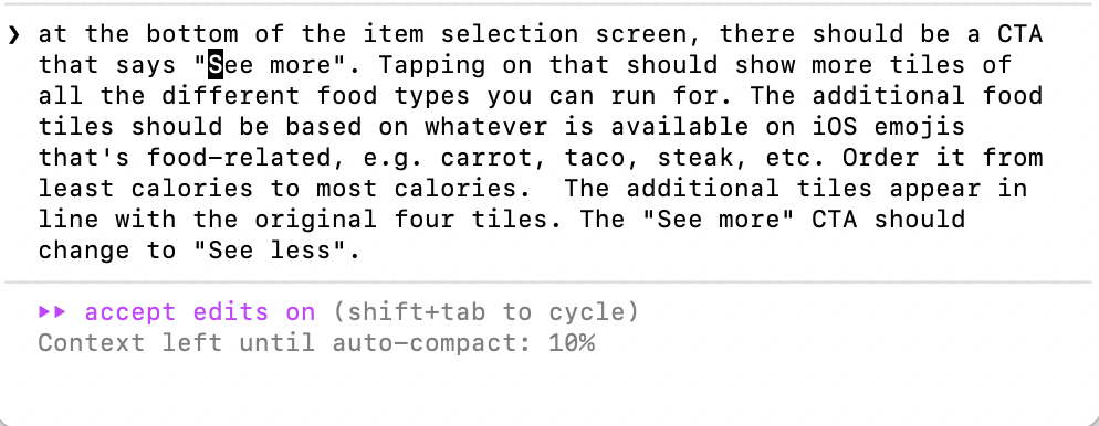
After simplifying the UI, it sparked new ideas and opened up new opportunities to add more variety/functionality to the screen. What if users can run for other types of food? Check out my prompt to the right.
With the addition of various food items, I also wanted to keep a running history (no pun intended) of which foods were last selected. For example, if your last run was for sushi, the sushi emoji would appear in the upper left corner on the home screen.
Build 2 | Segmenting the in-run screen
02/28/2026
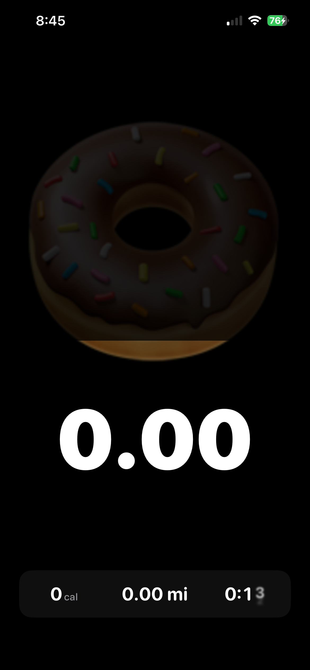
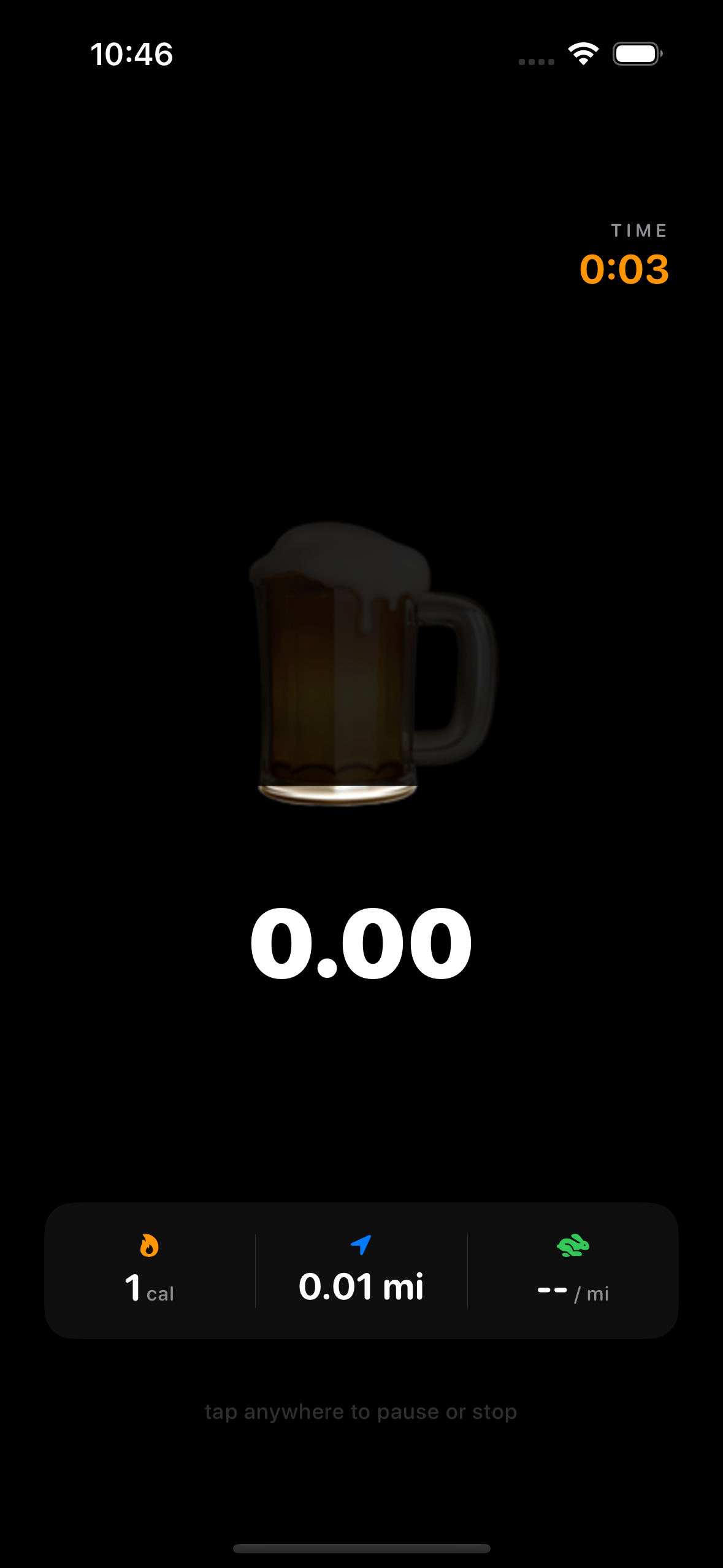
For the in-run screen, the item that you’re running for is split up to 10 segments. The 10 segments equals the total amount of calories for each item. I initially had the item appear instantly, but it didn’t really give users an idea as what the goal was. I experimented with the transition from item selection to active screen and landed on a cascading effect that briefly shows what needs to be filled and then resolves on the first segment blinking.
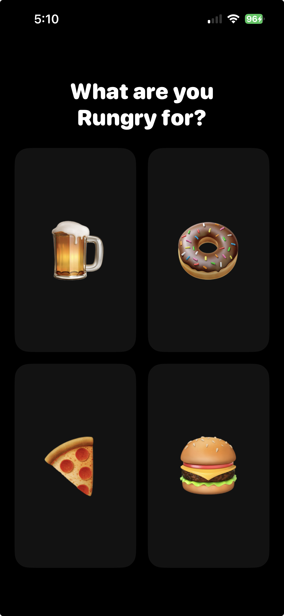
Build 1 | Getting started
02/25/2026
Being new to Claude Code, I didn’t know what to expect. Before starting, I had mapped out the core moments within the app experience.
Select what you’re rungry for
In-run screen
Pause screen
For the prompt, I initially stepped out the flow above and in just a few minutes, it generated the screens that you see below.
What are you Rungry for?
In-run screen
Pause screen