The ultimate rewards app
The Ultimate Rewards program is one of Chase’s biggest drivers in customer engagement and loyalty, however it’s hidden deep within Chase.com and the app. This project aims to bring it up to the surface for high value customers, e.g. Chase Sapphire Reserve members, by making rewards easier to access while showcasing the best of Chase. In October 2024, I was one of the first to join the team to help bring this vision to life.
The Brief
Transform the approved app concept into a polished, fully functional app experience that fits seamlessly within the Chase ecosystem.
Roles and Responsibilities
I was one of two lead product designers on a 5-person team, partnering with product and two remote dev teams to close UX gaps, evolve the design system, prototype flows, and concept new features. The team would expand as needed based on project needs.
Impact
We quickly took the project from 0 to 1, providing the development team with build-ready work while we iterated and built out the design library. We increased visibility and usability of the rewards program, reduced friction in user flows, and established a scalable design foundation. We also strengthened alignment between design, product, and remote development teams, enabling faster delivery and smoother implementation of features.
Work
The Beginning
Before I joined, a design agency had completed an approved design sprint, but the work contained UX and business requirement gaps. The initial design library also needed to evolve to meet our needs.
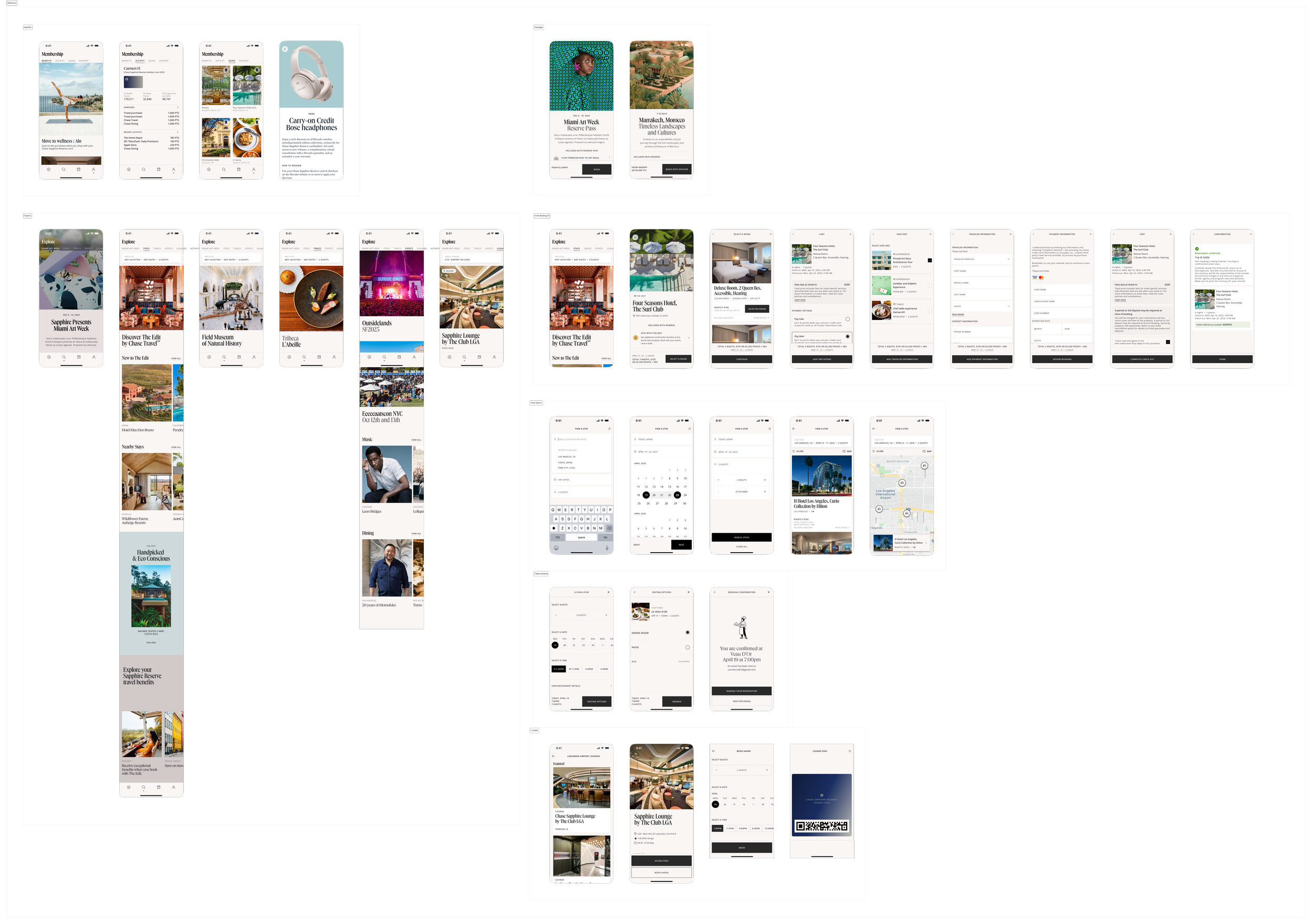
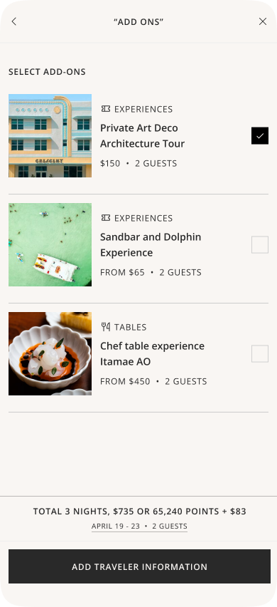
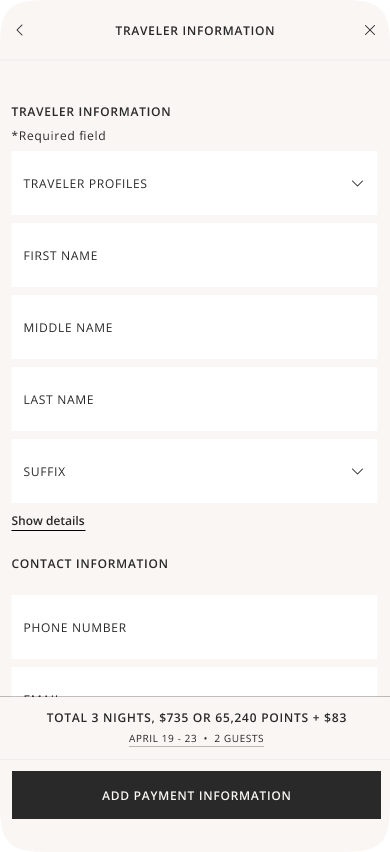
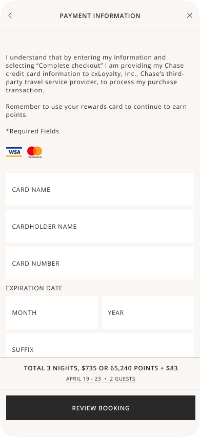
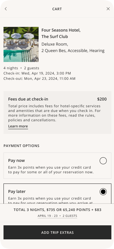
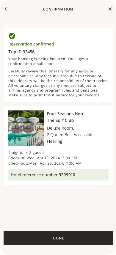
The initial set of screens that we started with.
Approach
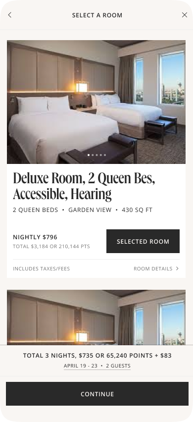
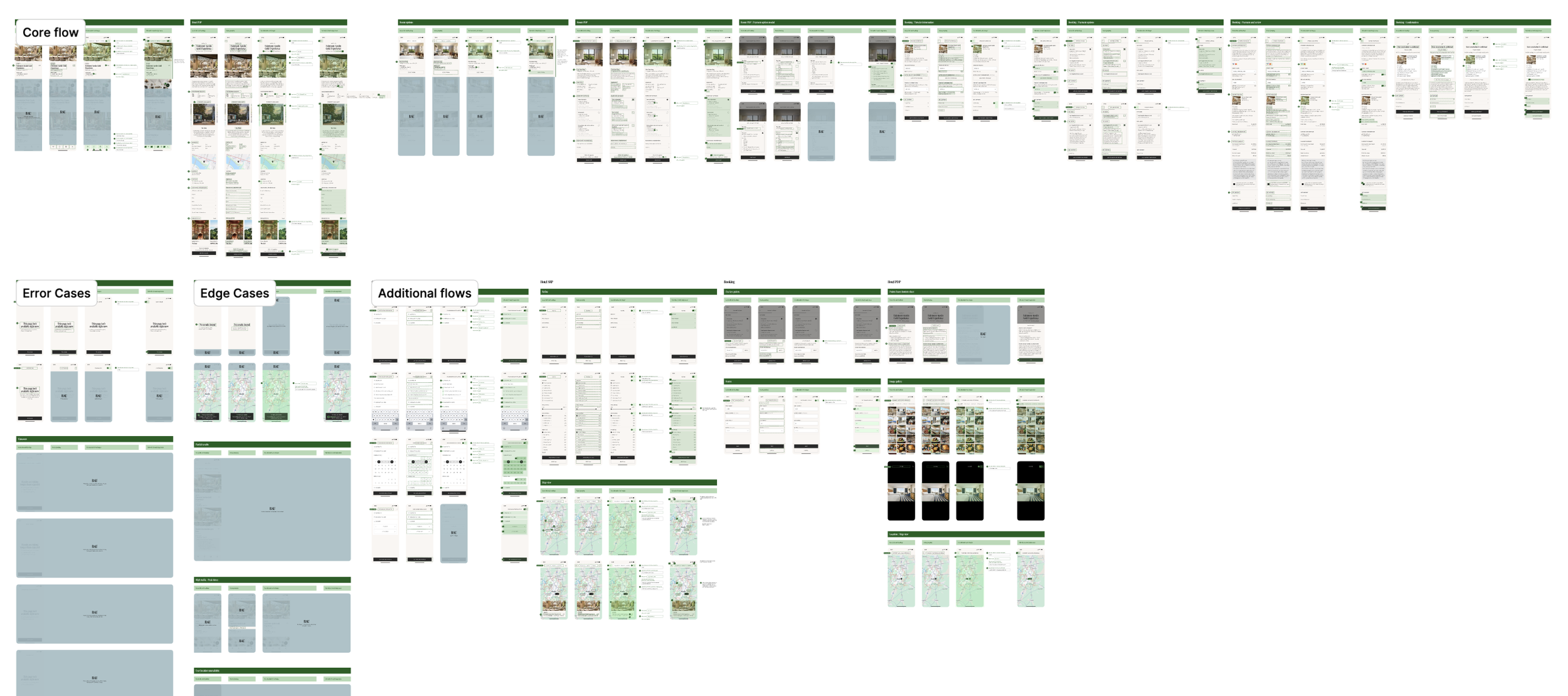
We initially tackled the end-to-end hotel booking flow since a version of it already existed within the Chase app. This flow will eventually inform all other categories within the app, e.g. lounges, activities, experiences, etc.
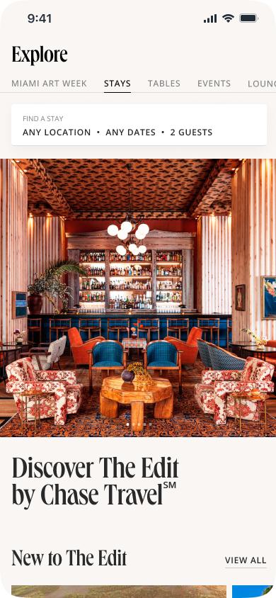
Auditing
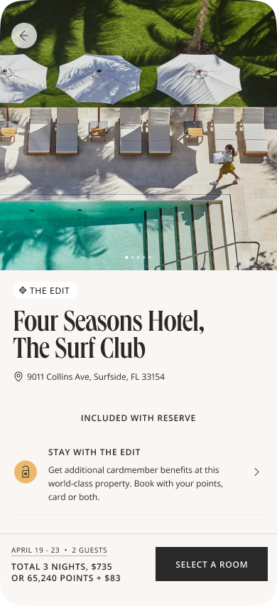
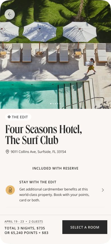
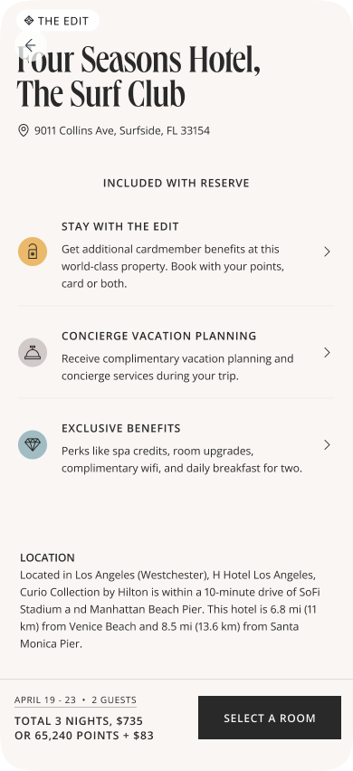
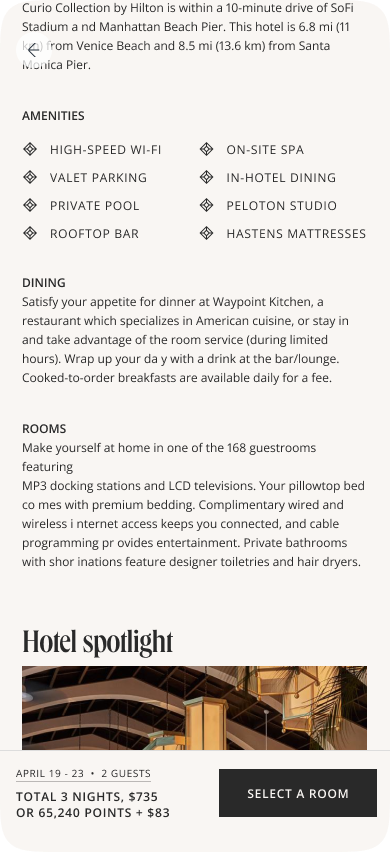
The audit covered all screens, core and secondary flows and edge cases. With the product team, I identified UX/UI issues and missing business requirements, then worked with product managers to quickly address them and share updates with dev teams. For brevity, the following is an audit on one of the screens within the hotel booking flow.
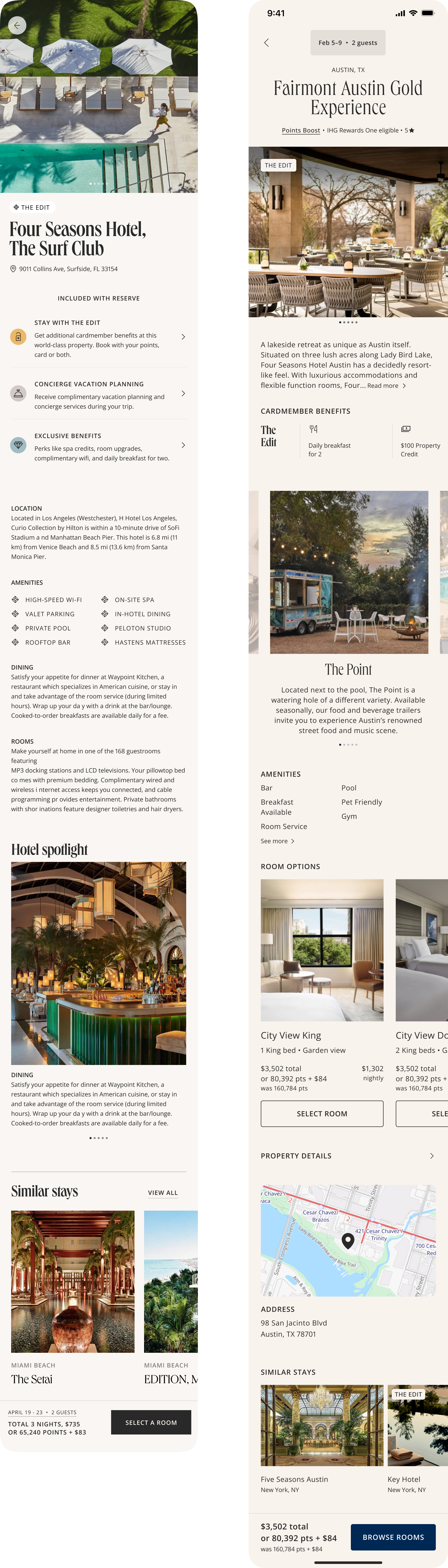
→ 1.2 Hotel detail page / Before
Consistent color contrast issues were found across UI elements creating accessibility issues.
The “Included with Reserve” section, repeats for all “The Edit” collection hotels and could be consolidated to reduce the amount of space it takes up.
Date editing placement varied between the top and bottom of the screen, creating UI inconsistency.
Content sections blended visually, reducing clarity.
→ 1.2 Hotel detail page / After
We moved the date selection UI back to the top for consistency.
Badges, e.g. “The Edit”, are now a lot more visible as it’s overlaid onto the image.
Pagination no longer sits on the image.
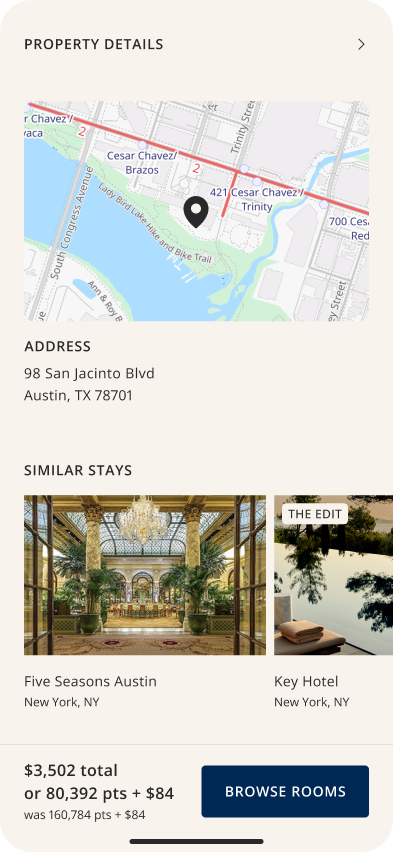
“Cardmember benefits” fka “Included with Reserve” no longer takes up as much space and now lives as a horizontal carousel.
We also factored in new content requirements from the editorial team, e.g. “The Point”, where specific aspects of a hotel are called out.
A “Room options” section was added to give more context around the hotel while providing users with a quick and easy way to book right from the hotel detail page.
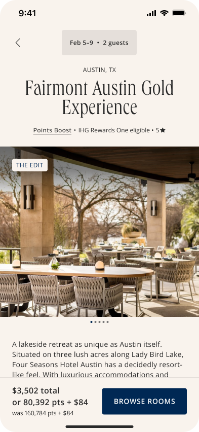
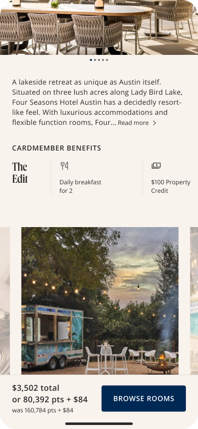
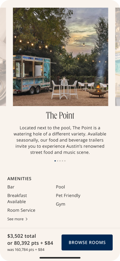
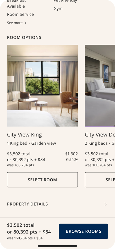
→ 1.2 Hotel detail page / Before and after
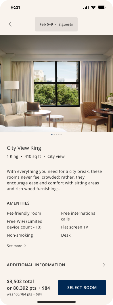
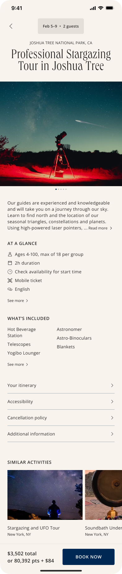
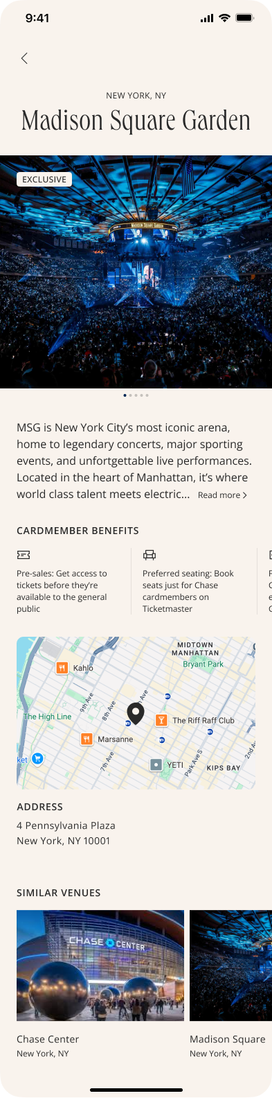
This final hotel detail page was then used as a foundation for the detail pages for all other categories. Each category had its own workstream to ensure that their respective flows and business requirements were met.



Prototyping
Prototypes were included in design-to-dev handoffs to help dev teams understand how screens connected within each flow. They were also helpful in quickly testing and evaluating which direction to take whenever a decision wasn’t clear. For example, the three prototypes below show how users can potentially interact with the date picker UI after selecting a hotel that they’re interested in staying at.
Option 1 | Date picker always at the top
Option 2 | Tap on price to access date picker
Option 3 | Date picker bottom to top transition
Building the design library
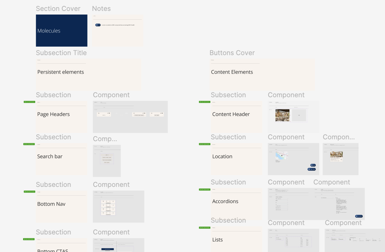
At the project’s start, we translated the provided design assets into an Atomic Design library. Over time, we refined existing assets and added more molecules (groups of basic UI elements) and organisms (complex components), standardizing the design and accelerating the process.
Designing for accessibility
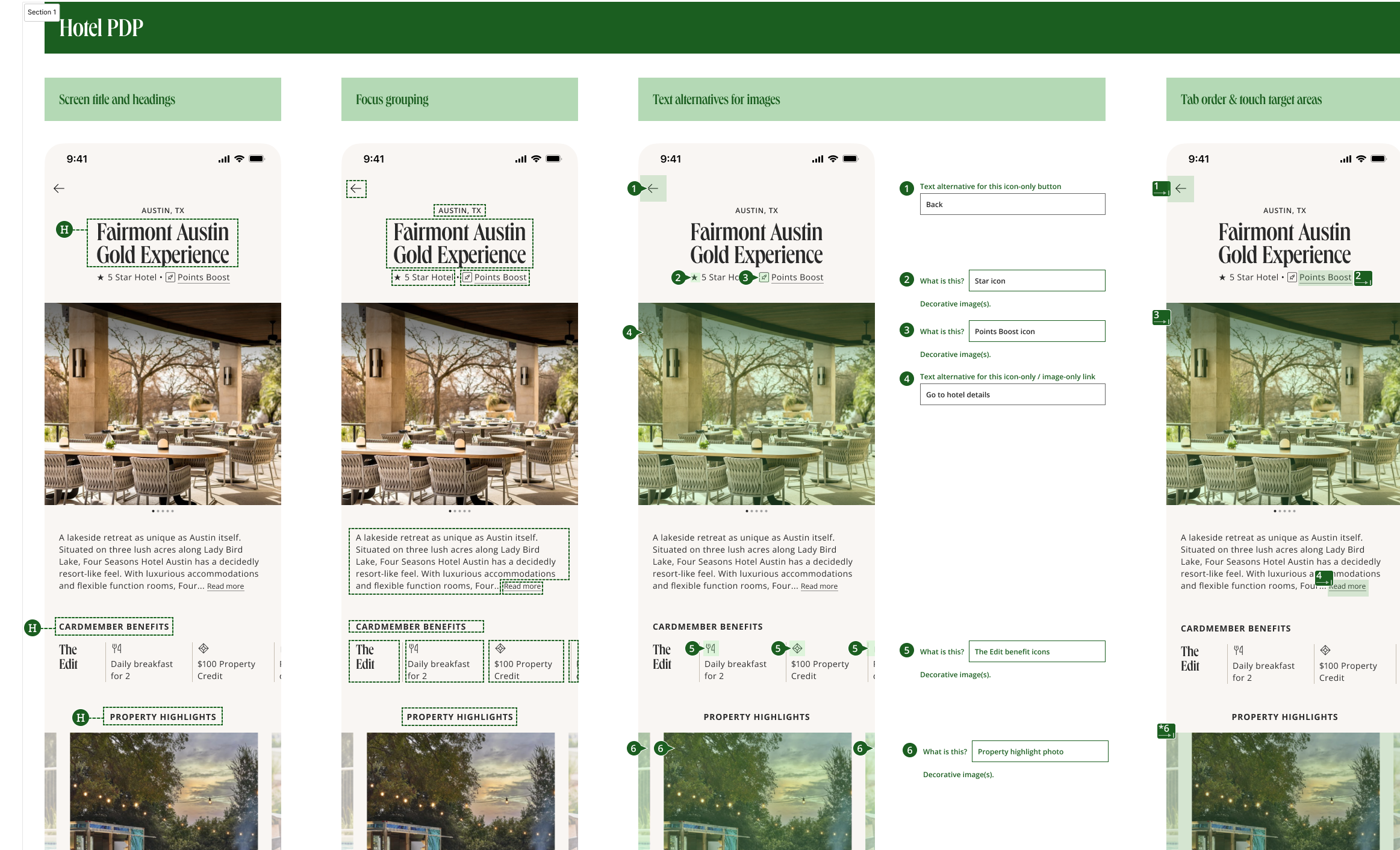
Prior to sending designs to dev, we ensured that all designs took accessibility into account, specifically for screen readers. At Chase, this is referred to as greenlining. Greenline documents give developers a framework and context in order to code for a more inclusive experience.
Wrapping up
The project is still in progress and is set to wrap up mid-2026.
Overall, it was a great learning experience working in-house with a lot of eyes on the project from up top. As we built out the flows and design system, design changes came down from leadership every other week, occasionally sending the creative and dev team into a frenzy. This has taught me to pace myself during the design process, which is the complete opposite in agency world.
Some key takeaways include:
Make sure that expectations are set with product managers
We can’t address EVERYTHING, especially when design is still in flux
Provide various options when approaching a design problem
This will squash any concerns of the team not doing further explorations later on (FOMO)
Ensure that when designs have been approved, it’s locked in until the next iteration
Not doing this will cause a lot of spin and wasted effort within both design and dev teams
“O’hana!”
Keep the team updated as to what everyone is working on. No one gets left behind.