A site for ALL your health needs
PfizerForAll.com is a consumer-facing platform designed to help people navigate complex health questions. As the site expanded to include hundreds of products, conditions, and content types, the experience became fragmented and difficult to scale. We set out to consolidate the ecosystem into a single, trusted platform that could support diverse health journeys while maintaining clarity, credibility, and ease of use.
Approach
The project ran in ten one-week sprints, with strategy and design working slightly staggered. Weekly briefs set priorities and insights, while design translated strategy into research- and data-informed user experiences built to scale.
Role and Responsibilities
My role was experience lead connecting strategy, UX, and system-level design to help people navigate complex health decisions with clarity and trust. Key responsibilities included:
Experience and competitive audit
Strategy-to-UX translation
Sprint-based flow definition
Wireframing and component-led design
Gap identification and flow optimization
The Work
Most case studies start with polished deliverables. This one starts with sketches because that’s where my creative process begins.
Rather than cataloging every artifact, I’ll focus on key moments of the experience and share how we explored options before aligning on the right direction.
Homepage
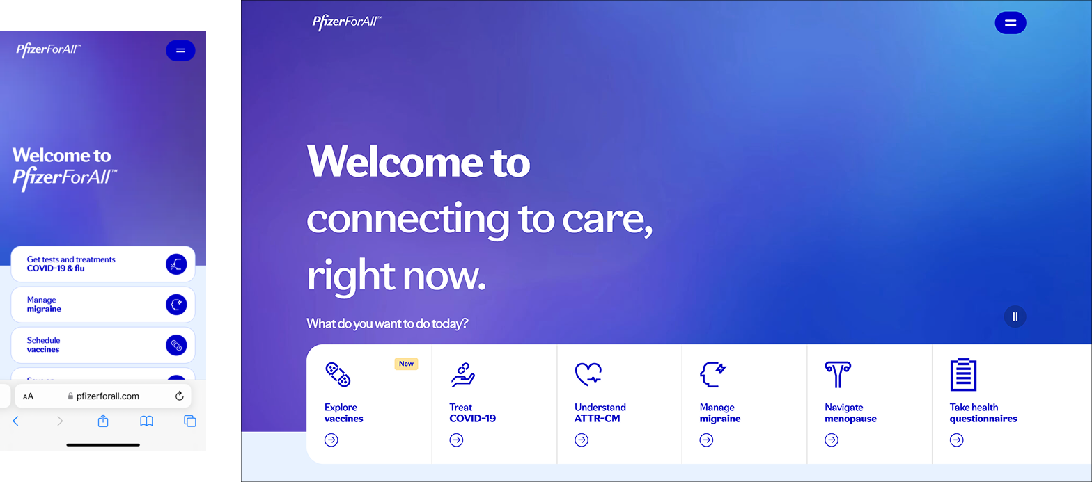
The primary navigation was buried behind a hamburger menu, leaving “What do you want to do today?” as the main entry point. This placed decision-making burden on users who often arrived without clarity or confidence. The random mix of conditions and actions, i.e. Treat COVID-19, Understand ATTR-CM, etc., didn’t help either.
I explored homepage concepts that introduced the site in a way that was understandable, practical, and brand-forward. It was also important that the components could scale to various types of content.
Evergreen condition education
Time-bound campaigns (e.g., vaccines, COVID, awareness months)
Interactive tools and questionnaires
Emerging priorities

This early homepage sketch blends clarity, practicality, and brand expression above the mobile fold. A rotating mad-lib framework allows the hero to scale across campaigns and conditions, while categorized content below supports users seeking information and next steps.


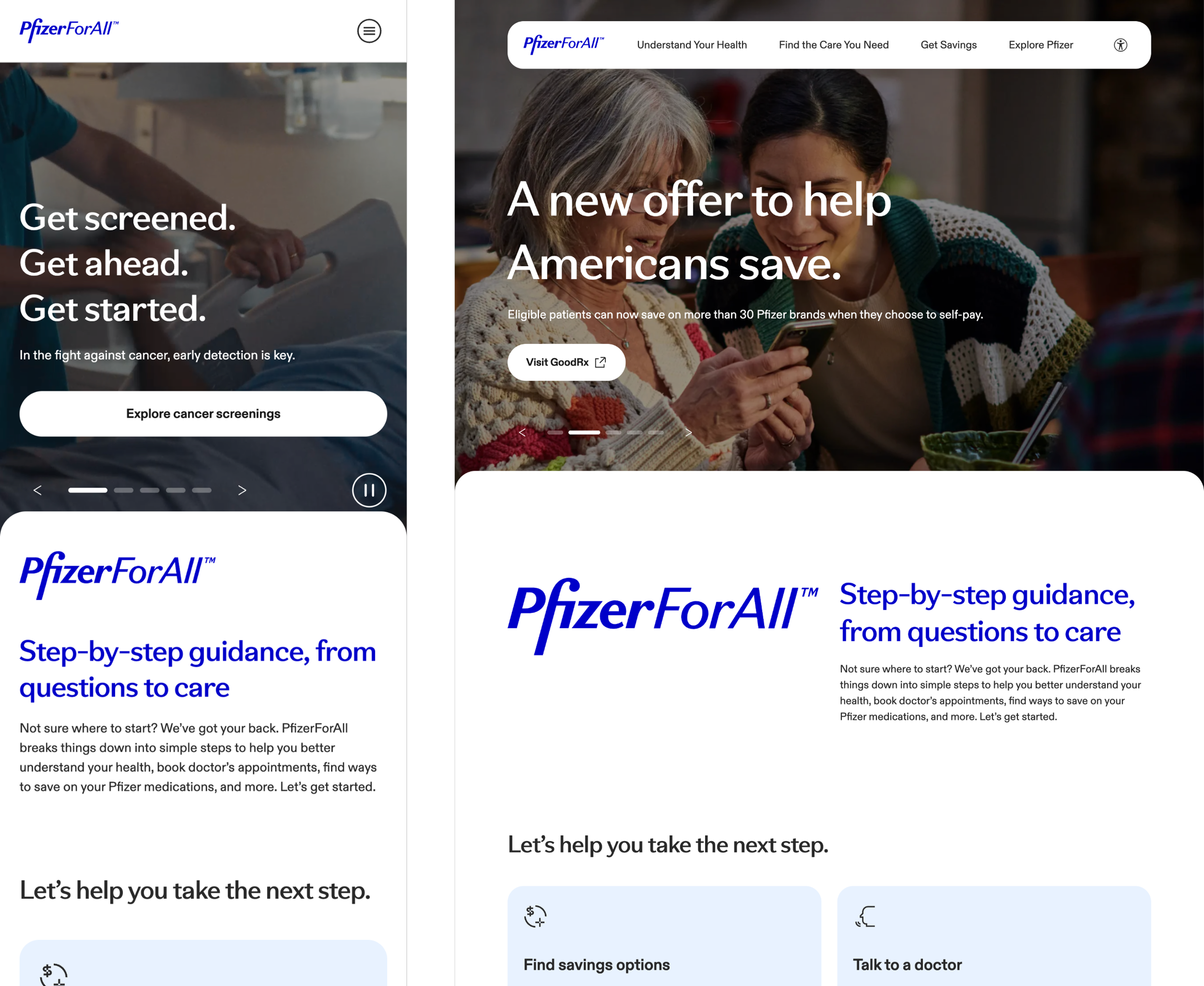
The final homepage adopts a familiar B2C healthcare pattern. A top carousel supports discovery across categories, followed by a clear statement of purpose and CTAs aligned to users’ most common needs.
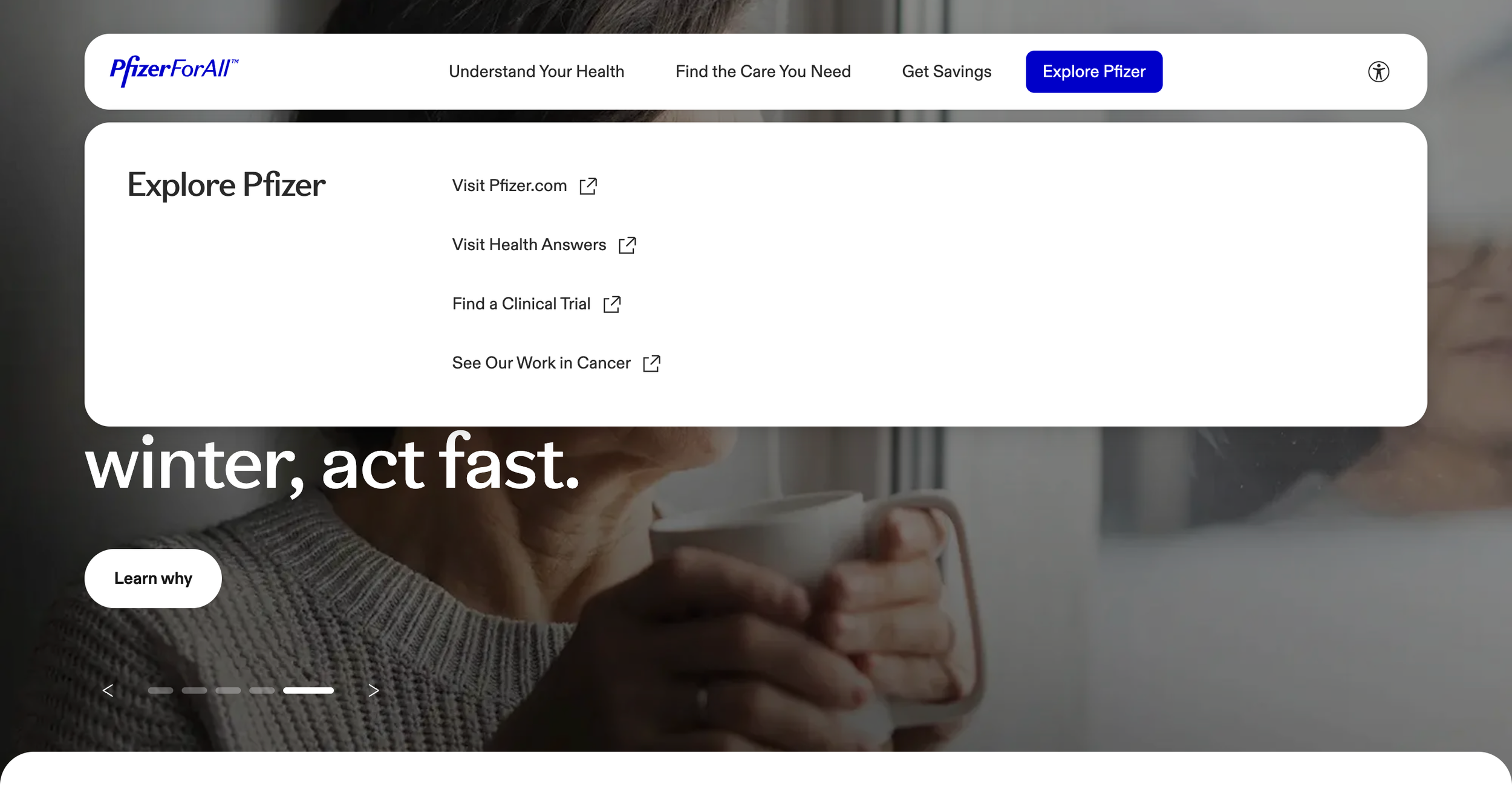
Navigation
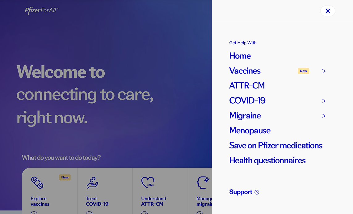
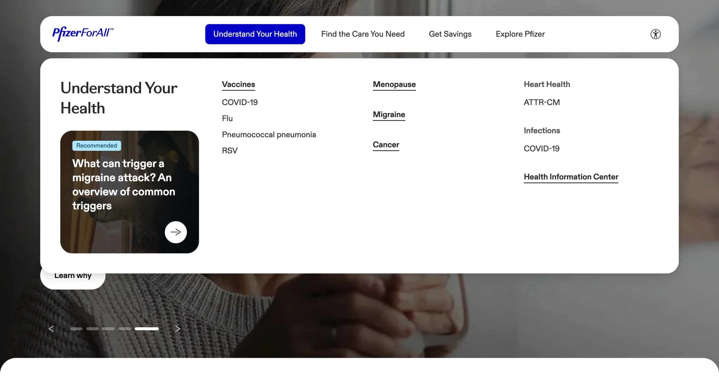
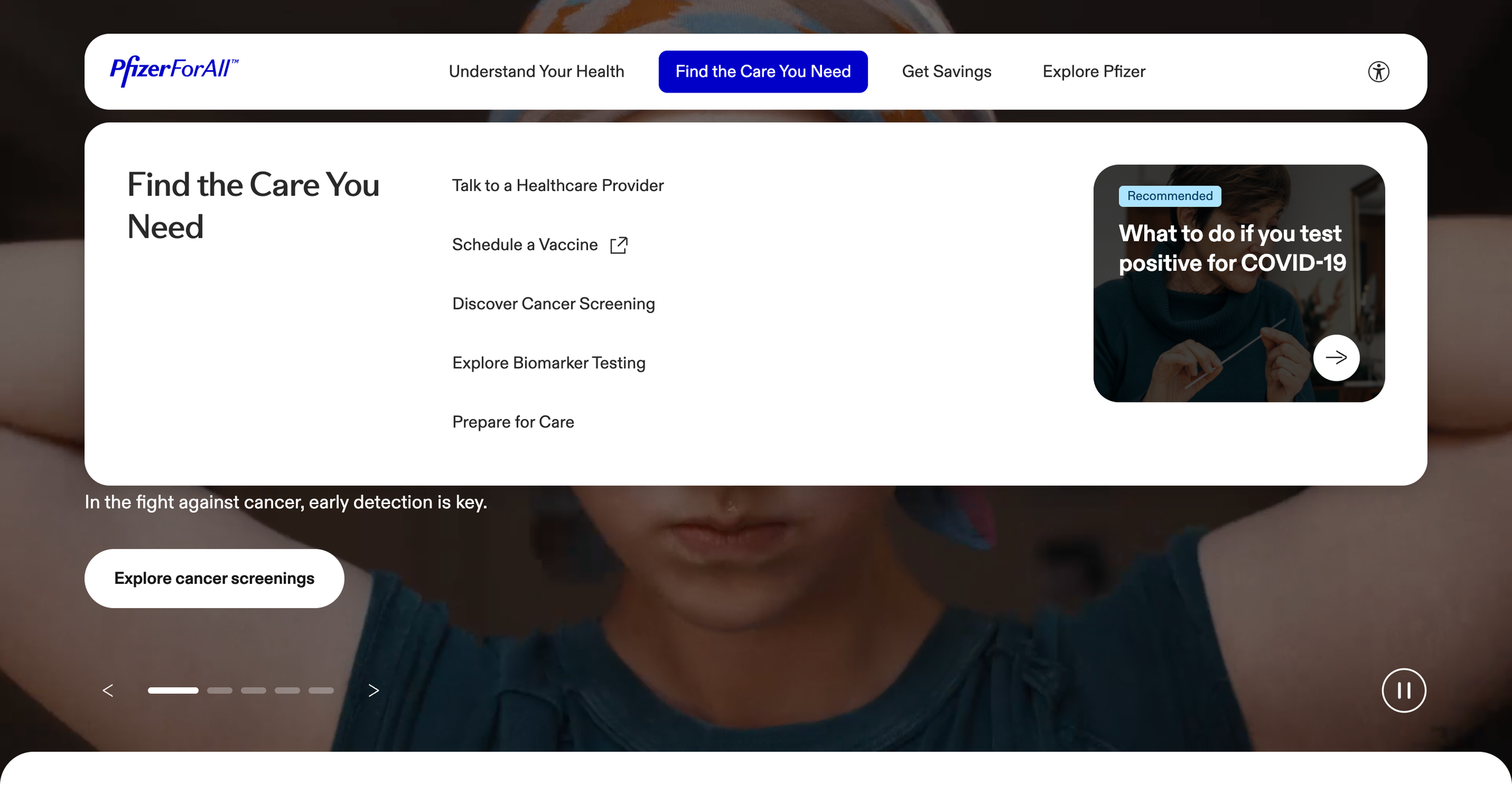
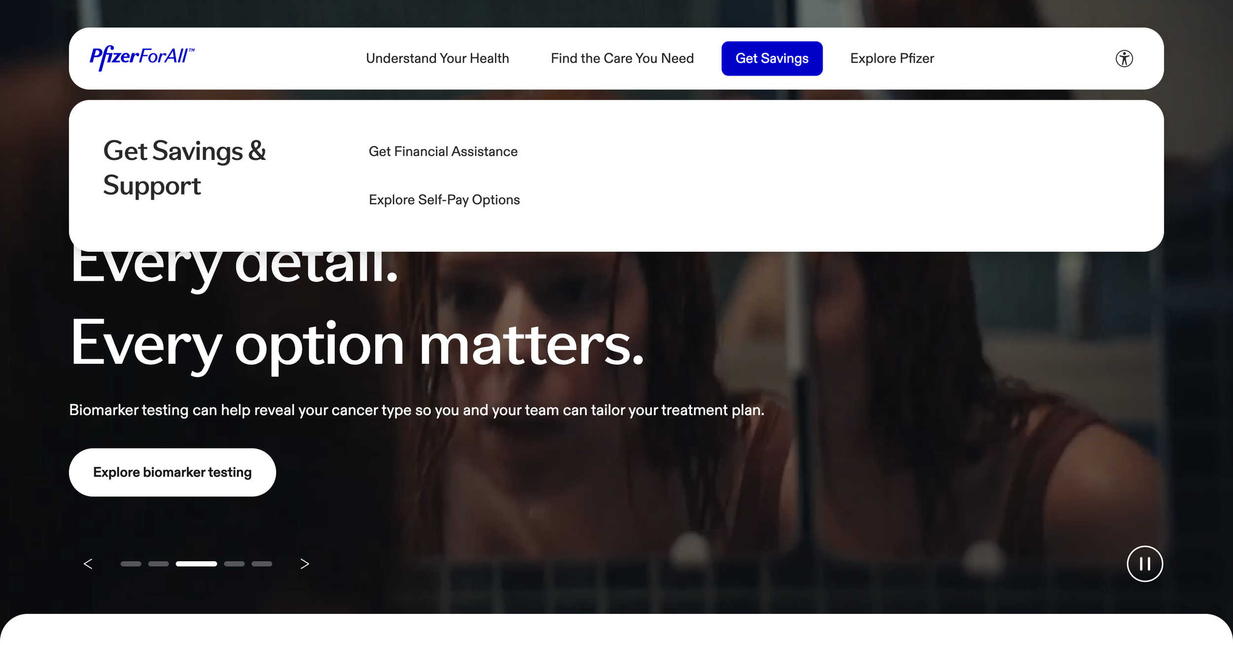
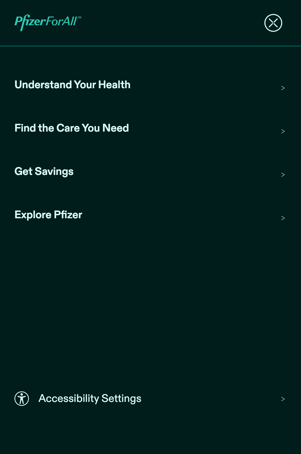
When expanded, the main menu functioned more like a directory than a guide, asking users to self-diagnose before they had enough context. It also struggled to scale as new conditions were introduced.
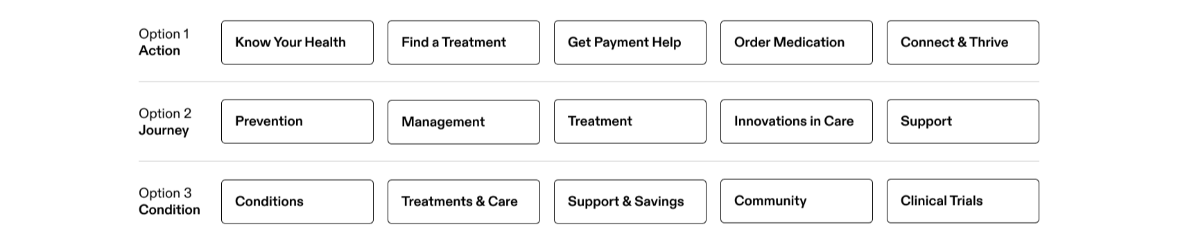
In collaboration with content and copy, we explored three thematic navigation models. As a UX pragmatist, I was drawn to the simplicity of the condition-based approach. But it diluted the brand’s intent and the guidance we aimed to provide. Ultimately, we chose the action-led model—clear, intuitive, and aligned with our goal of empowering users to take their next best step.
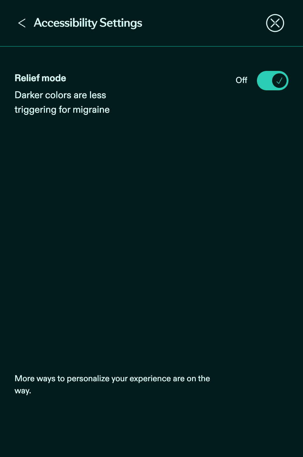
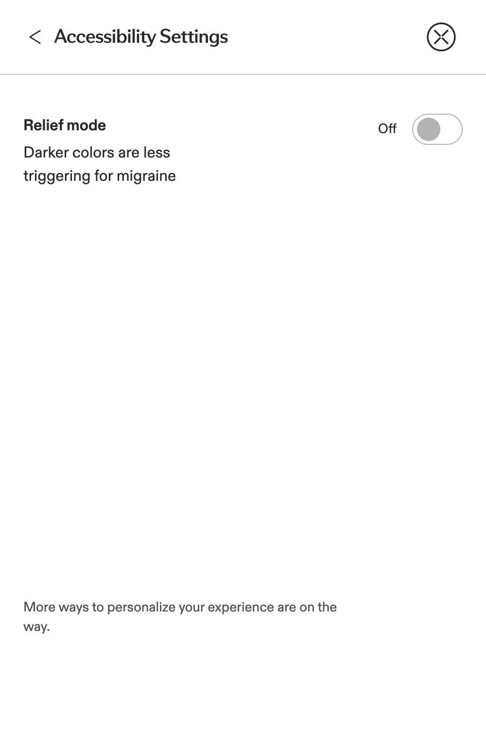
Accessibility Mode (fka Relief Mode)
Our audit also uncovered a differentiator. The migraine page included a “Relief Mode” that was designed to reduce visual strain for users experiencing migraines, especially those sensitive to light, contrast, and motion.
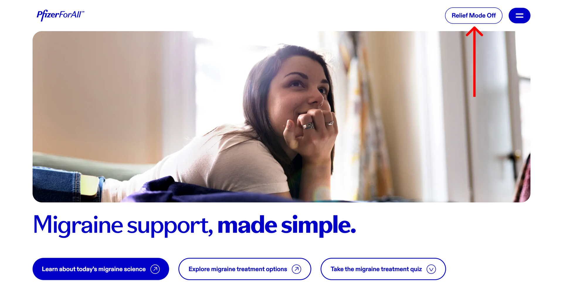

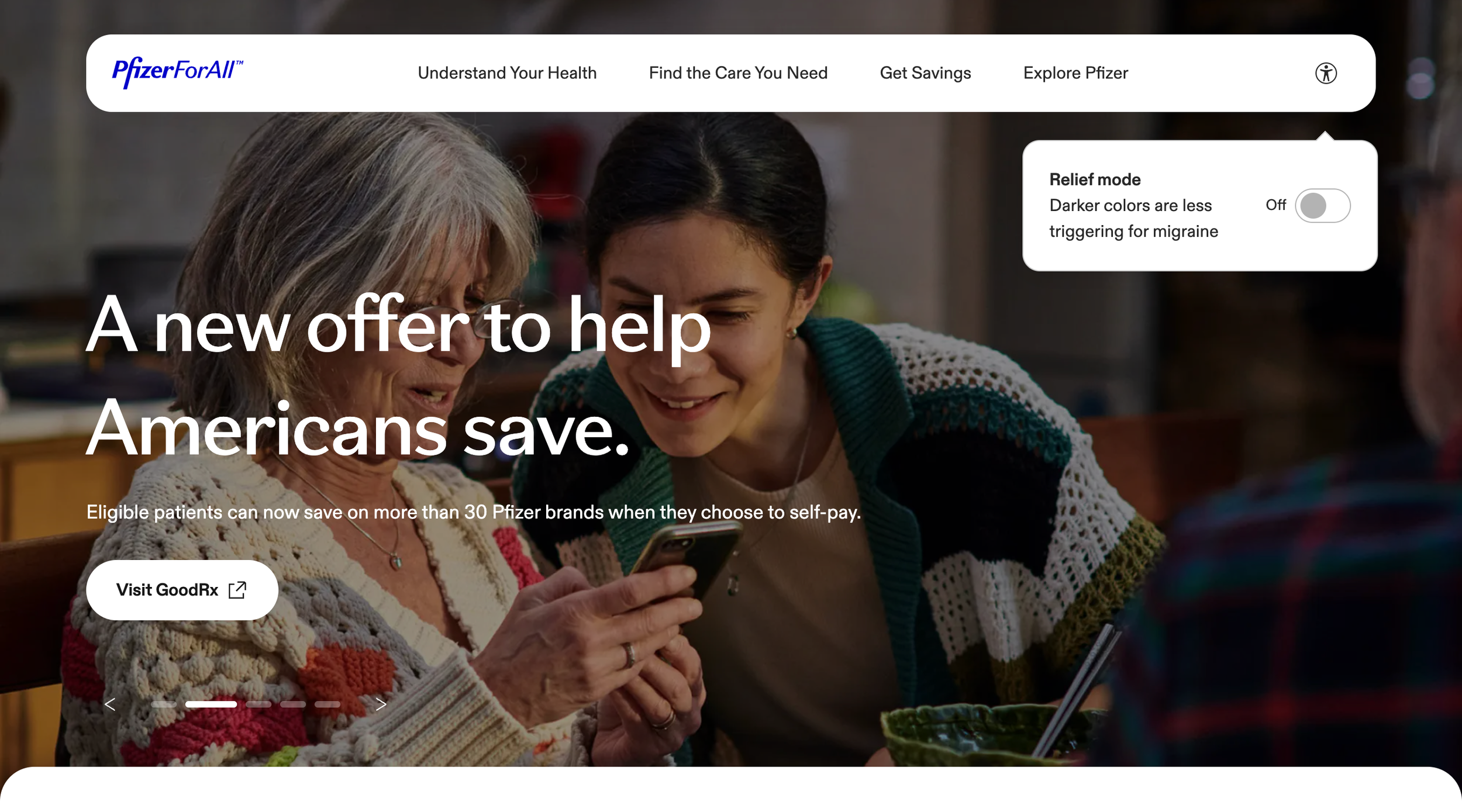
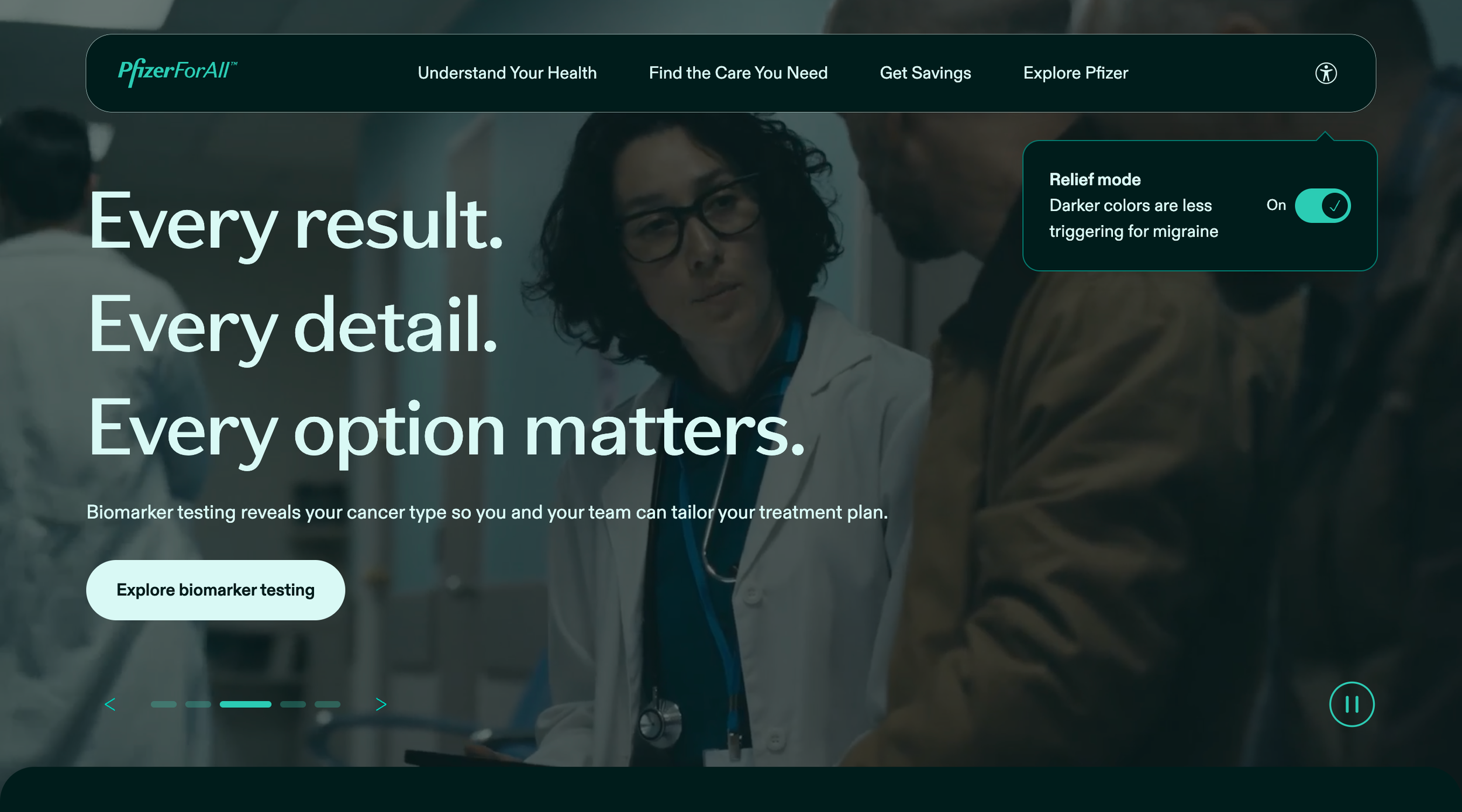
That insight reframed the platform from being just a site for all conditions, but for all people and conditions. I proposed scaling this feature site-wide and evolving it beyond migraine-specific use.
Biomarker Testing Doctor Discussion Guide
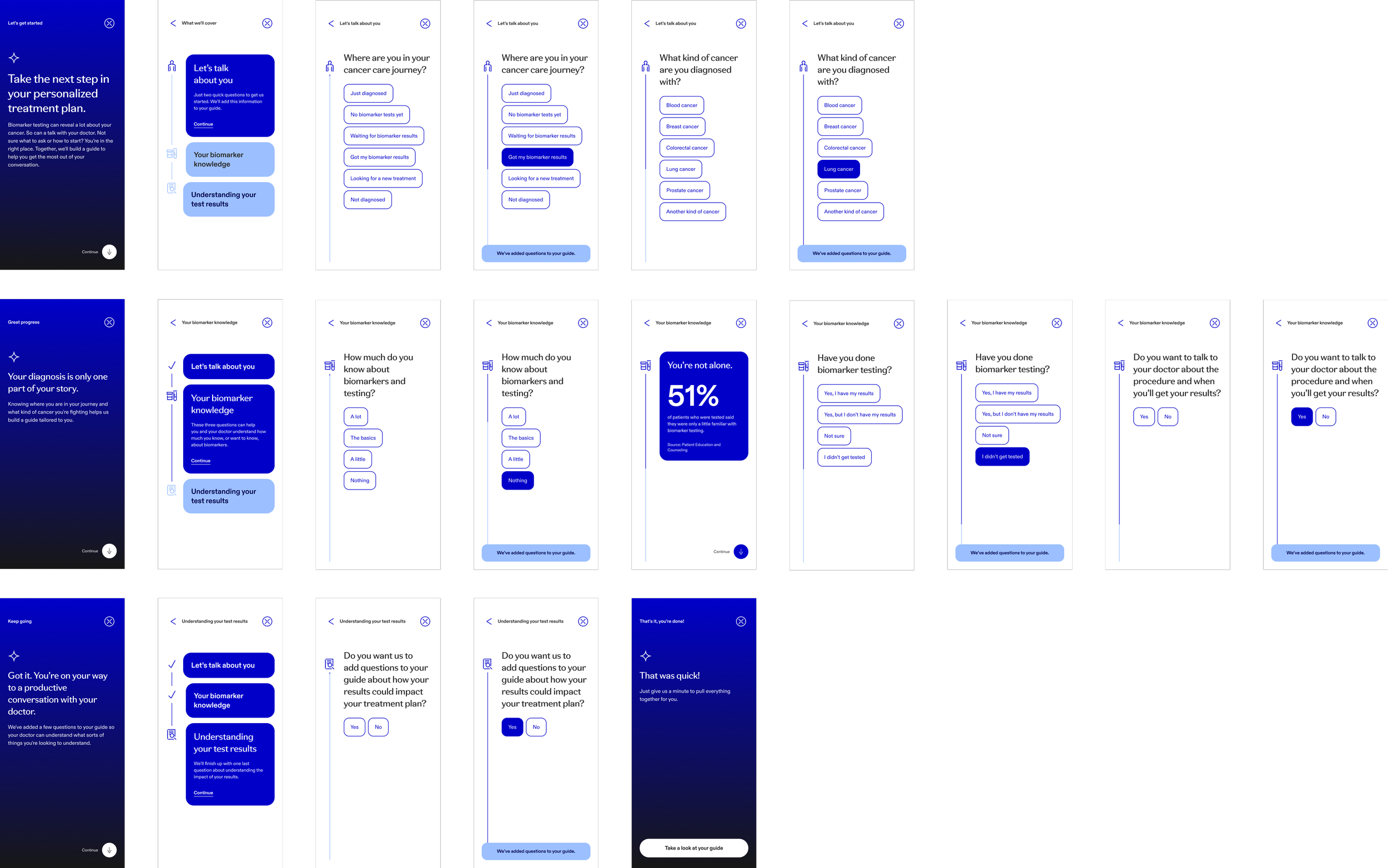
As Pfizer set out to become the go-to destination for cancer support, we created a tool to help patients understand biomarker testing and prepare for conversations with their doctor. Because many users were newly diagnosed, we calibrated the tone and detail to be clear, supportive, and actionable.
Early sketches explored a brief set of context-setting questions to understand where someone was in their journey. Based on those responses, the tool generated recommended questions to ask their doctor, allowing users to select the ones most relevant to them.


A mix of radio button and checkbox inputs accompanied by micro-interactions, e.g. Why it matters?, made this approach feel overly complicated and laborious. The goal was to make this feel quick and easy without creating more anxiety for our users.
We simplified the UI, reduced on-screen elements, and introduced supportive interstitial moments throughout the guide. We also refined the question logic to make the flow feel intuitive and personalized. As recommended questions were added to the discussion guide based on user responses, a subtle toast notification confirmed each addition in real time.

Wrapping it up
This was just the beginning. In 16 weeks, we built a platform that delivered expert guidance in moments of need, connecting users to board-certified doctors and Pfizer treatments, all in clear, human language. Check out the site at pfizerforall.com.