Samsung Within
Samsung wanted to turn their users into brand advocates. One problem we identified was that Samsung users simply didn’t know enough about the company to advocate for it. With Samsung Within, we presented incredible untold stories that would make Samsung users proud while keeping them engaged and interested.
Concept
Samsung Within is an interactive experience that puts viewers in control and encourages them to explore. Each chapter utilizes a unique interaction from discovering the meaning of Samsung’s name in 360° through A/R, to building the phone the world said was impossible by tracing the blueprint with their finger. Following the launch, Brand Preference went up by 21% and Brand Pride increased by 14%—showing that Samsung had stories powerful enough to change perceptions. They just needed to be told.
The Work
The beats of each chapter was put together by our experience strategy team, which served as individual briefs to the creative team. I was the UX lead across chapters 2-6 and worked with a copywriter and the visual design team to ensure that there was a level of consistency among all the chapters.
Chapter 2 / The Meaning of Our Name
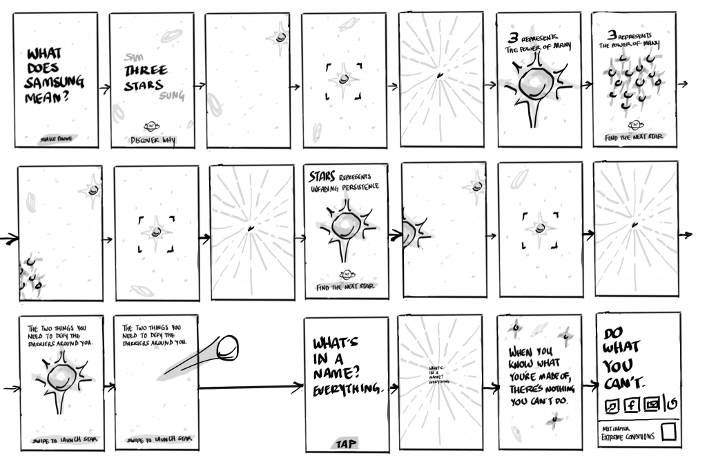
This chapter explains the meaning of “Samsung” through the lens of space. Users are encouraged to explore their surroundings using A/R technology. Additional points of interaction, i.e. sending a star through space with a swipe of the screen, are also included in this chapter.
Chapter 3 / Extreme Conditions
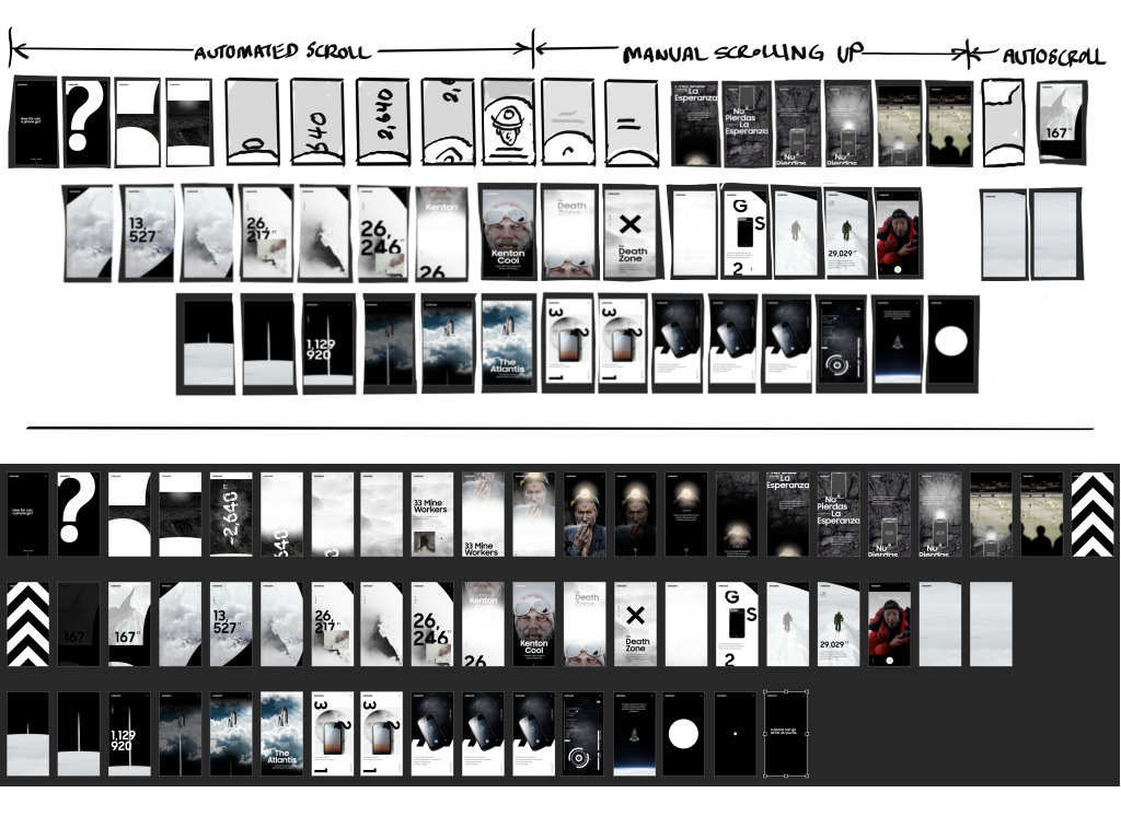
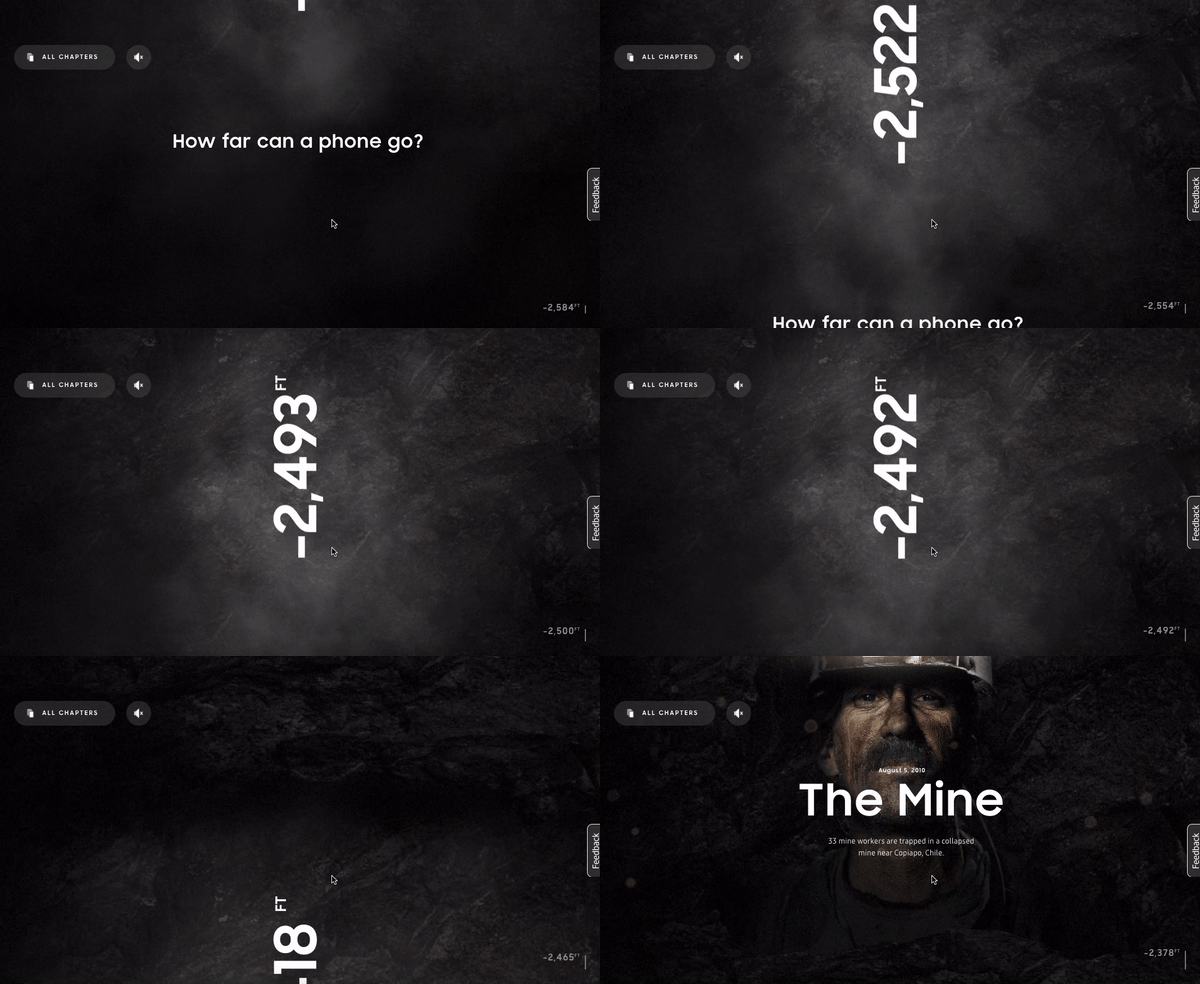
The Extreme Conditions chapter showcases the many ways Samsung was there when people needed it most. This chapter uses vertical scrolling as a way to simulate the traversal from the mines of Chile to the top of Mt. Everest and eventually into outer space.
Users are encouraged to scroll the page, which takes them from the mines of Chile…
to the top of Mt. Everest…
and into outer space.
Chapter 4 / A Phone Built on Can’t
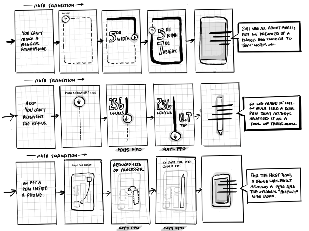
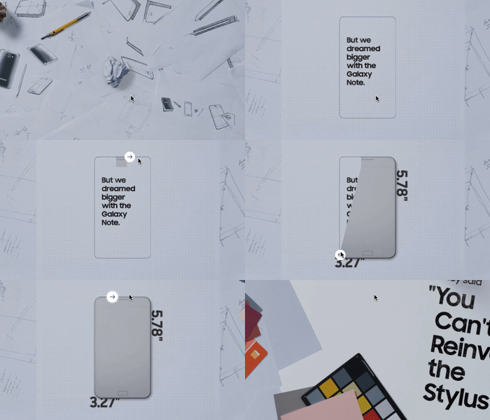
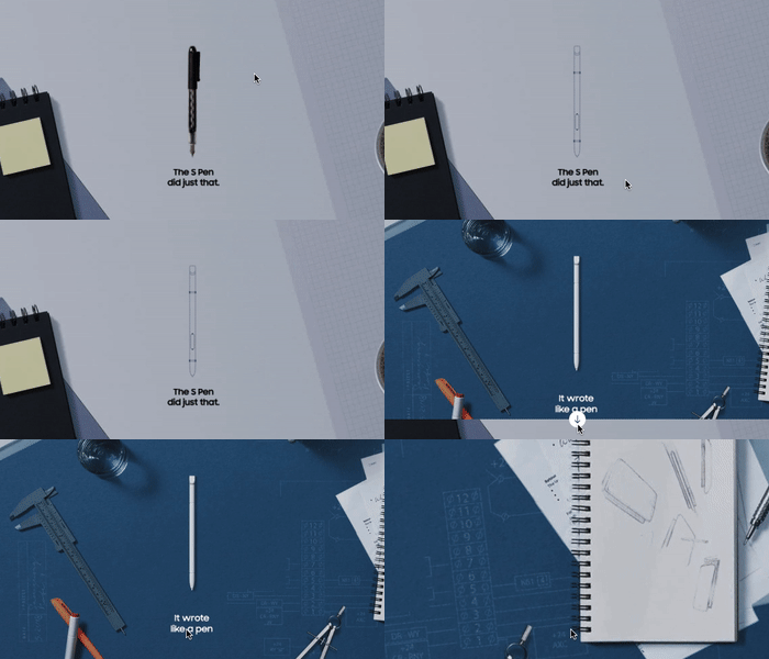
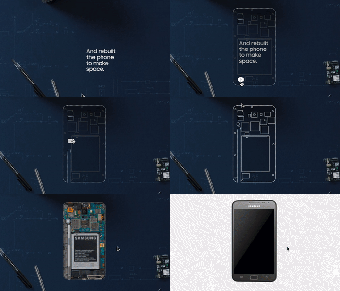
This chapter was based on stories from the development of the Samsung Galaxy Note. We wanted to put users into the lab with the engineers by having them participate in quick interactions throughout the story.
Trace the silhouette of the phone with your finger to reveal the size of the phone
Swipe down to create the S-pen
Swipe the S-pen up into the phone to see how engineers reconfigured the phone’s hardware to make room for the pen
Chapter 5 / More Than a Stylus
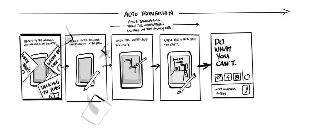
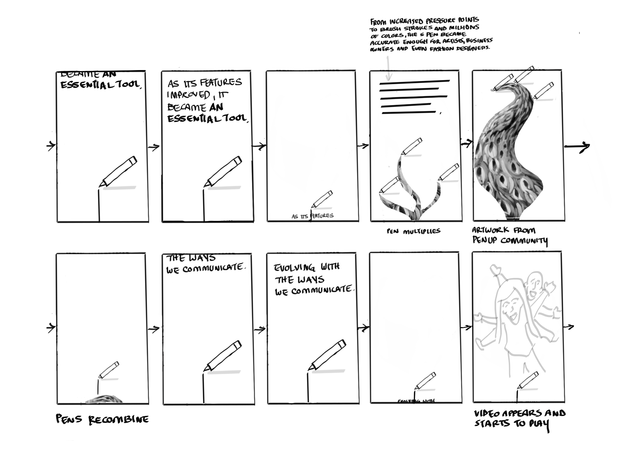
This chapter focused on the evolution of the stylus. To lead users through the story, we utilized the tech found in our audience’s phone, specifically the gyroscope and accelerometer. The idea was that as users tilted and rotated their phones, they would be navigating through the history of the stylus while also creating an experience similar to that of drawing with a pen.
As the user tilts their phone, the pen would start drawing the chapter
Chapter 6 / Testing for Life
This chapter showcases the rigorous testing that goes into each Samsung device in order to make it life-proof. Users are encouraged to tap on the screen to walk through the various tests as though you were behind the looking glass at Samsung headquarters.
